IB Economics Diagrams
Master essential economic diagrams with detailed explanations and examples
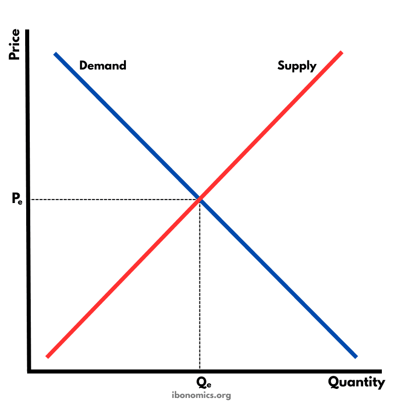
The fundamental diagram showing the relationship between demand and supply in a competitive market, determining equilibrium price and quantity.
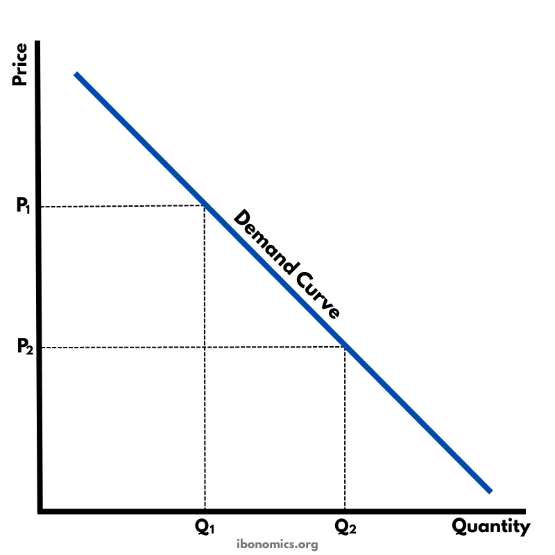
A basic diagram showing the inverse relationship between price and quantity demanded, illustrating the law of demand.
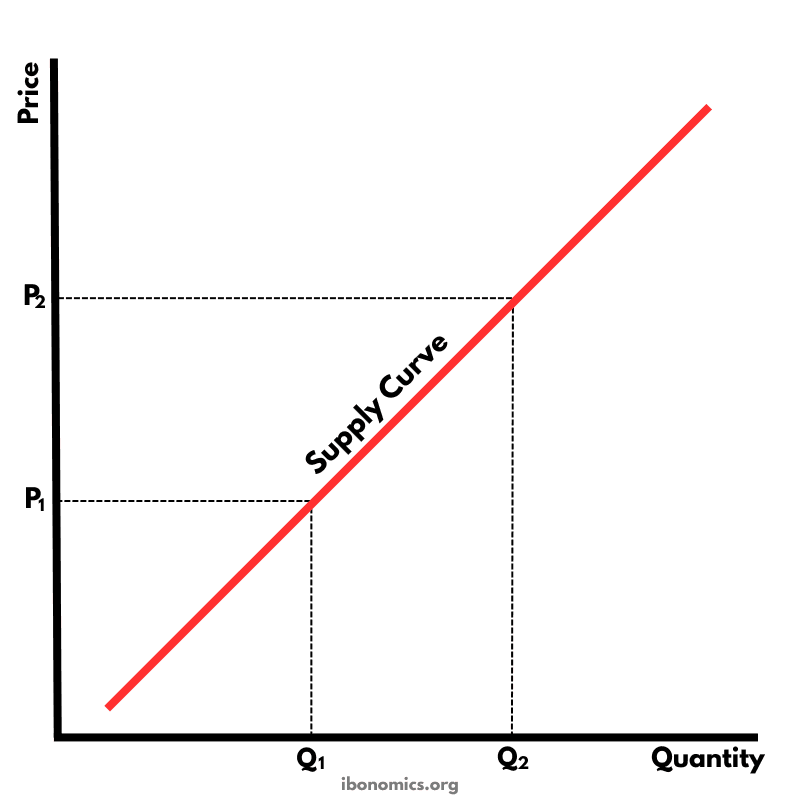
A basic diagram showing the positive relationship between price and quantity supplied, illustrating the law of supply.
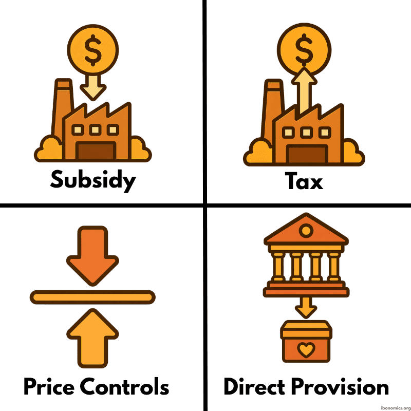
A simple diagram showing four common forms of government intervention in markets: subsidies, taxes, price controls, and direct provision.
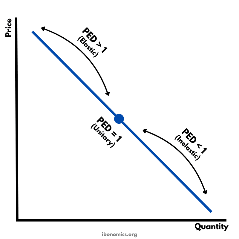
A diagram showing how price elasticity of demand changes along a straight-line demand curve, from elastic to unitary elastic to inelastic.
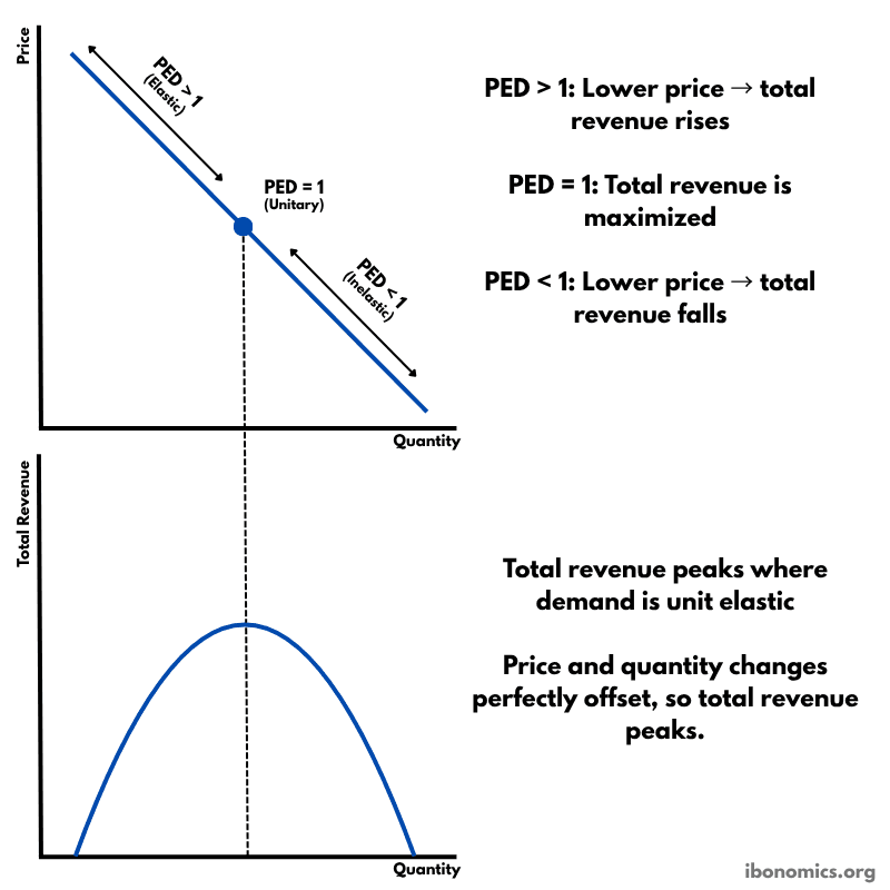
A diagram showing how price elasticity of demand affects total revenue, with total revenue maximized where demand is unitary elastic.
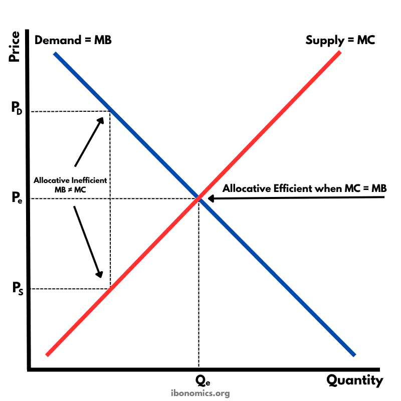
A diagram showing that allocative efficiency occurs where marginal benefit equals marginal cost, meaning resources are allocated to maximize welfare.
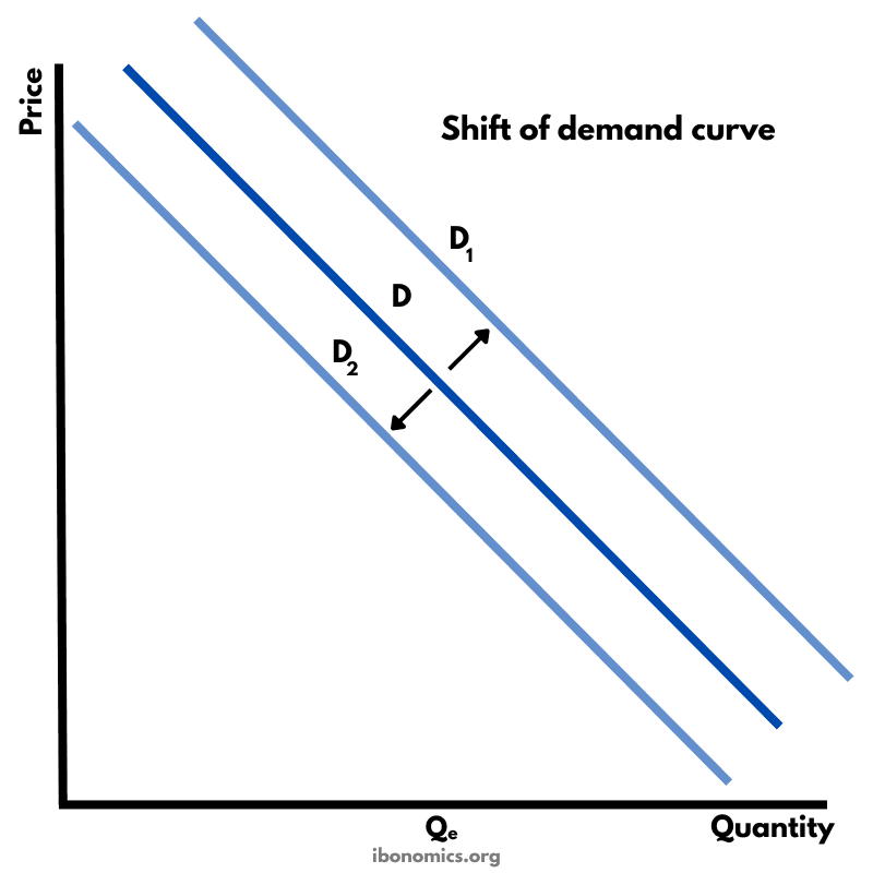
A diagram showing how the whole demand curve can shift to the right or left when a non-price determinant of demand changes.
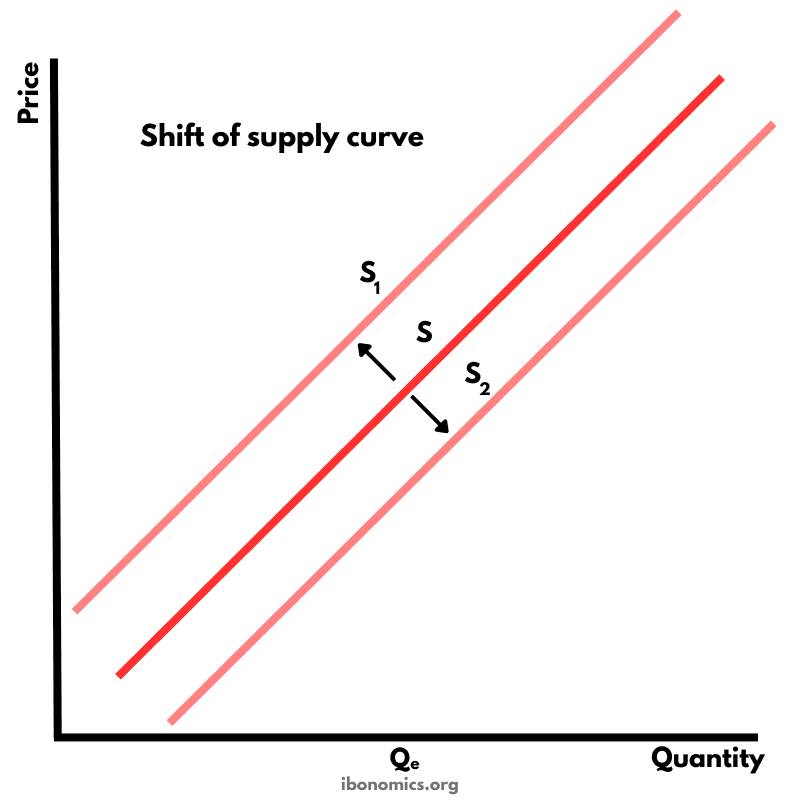
A diagram showing how the whole supply curve can shift to the right or left when a non-price determinant of supply changes.
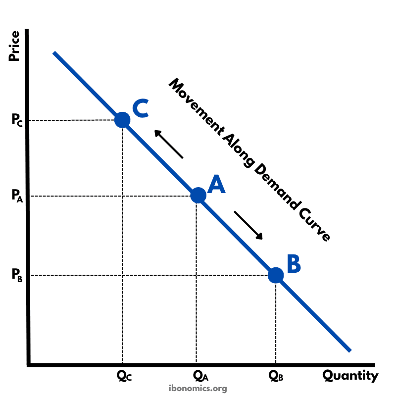
A diagram showing movements along a demand curve caused by changes in the price of the good itself.
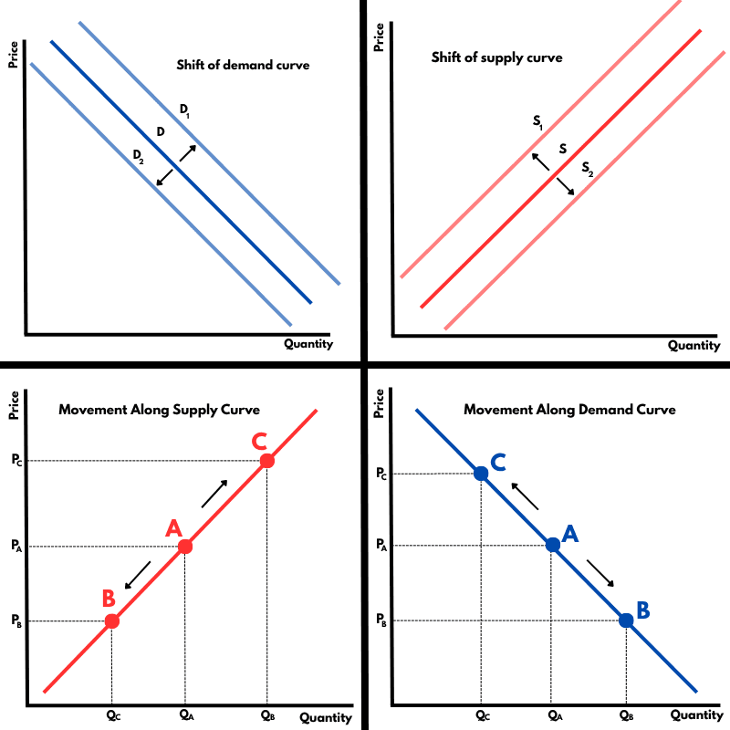
A compact diagram comparing movements along demand and supply curves with shifts of the demand and supply curves.
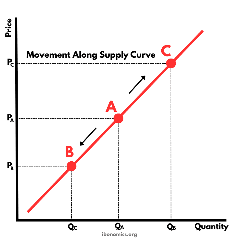
A diagram showing movements along a supply curve caused by changes in the price of the good itself.
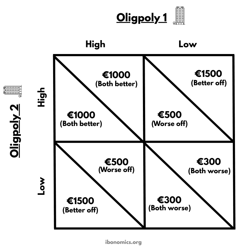
A payoff matrix showing the prisoner's dilemma in an oligopoly, where two interdependent firms choose between a high price and a low price.
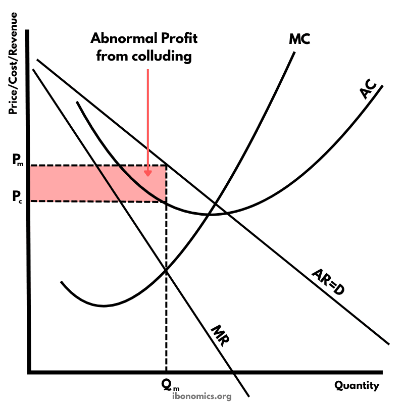
A diagram showing how firms in an oligopoly can earn abnormal profit when they collude and behave like a monopoly.
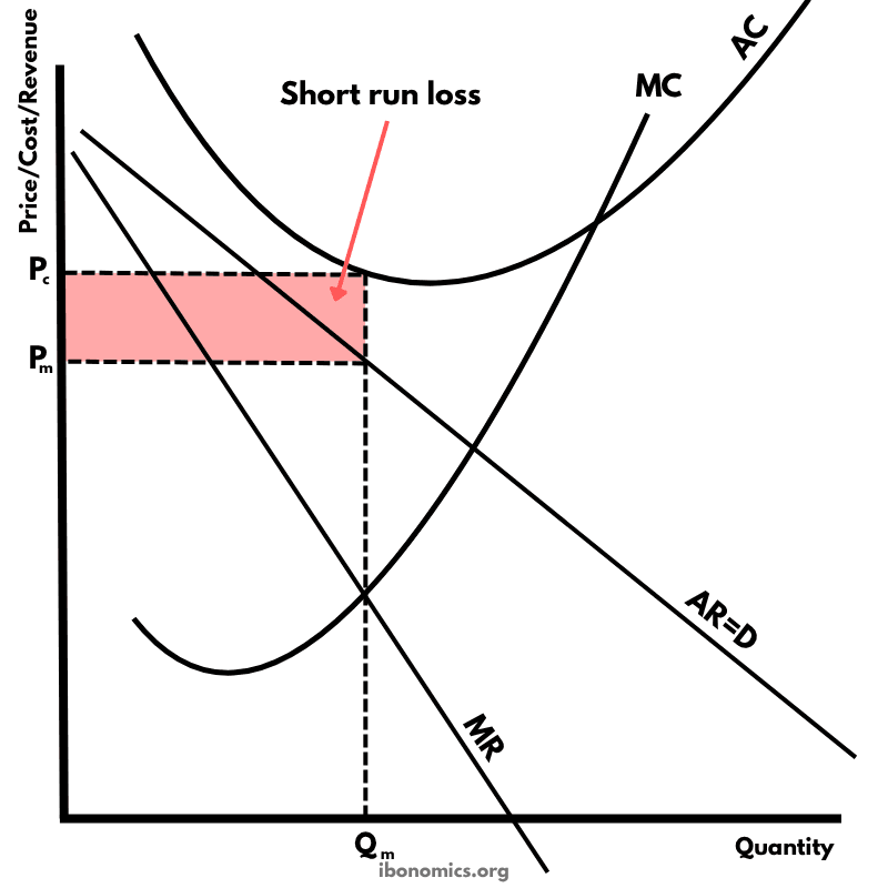
A diagram showing a monopolistically competitive firm making a loss in the short run when average cost is above price.
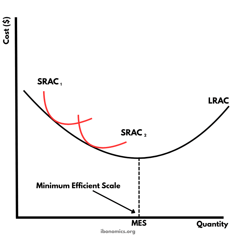
A diagram showing the long run average cost curve and the minimum efficient scale, where a firm reaches the lowest possible average cost in the long run.
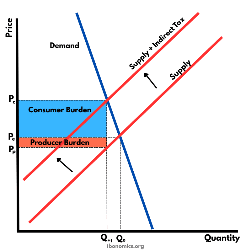
A supply and demand diagram showing the effect of an indirect tax on a good with inelastic demand. The consumer bears a larger share of the tax burden.
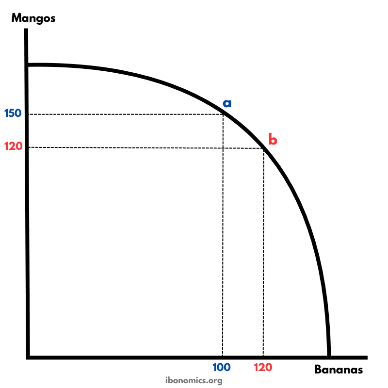
A production possibility curve illustrating the concept of opportunity cost and the trade-offs between producing two goods: mangos and bananas.
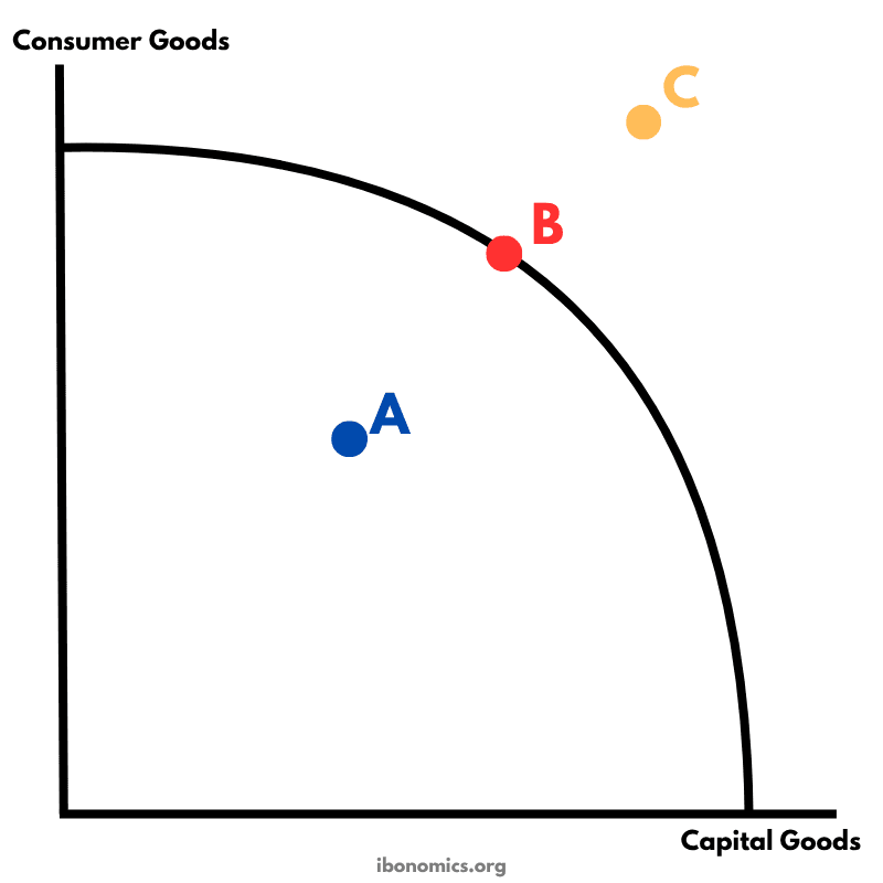
A PPC diagram showing different levels of production efficiency and economic feasibility using combinations of consumer and capital goods.
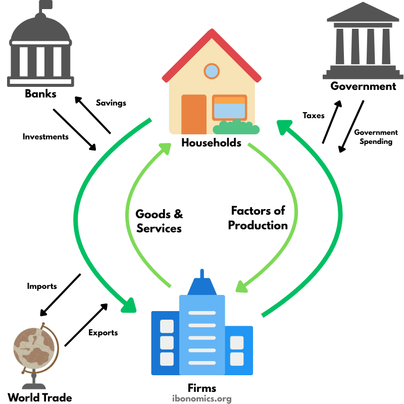
A model illustrating how money, goods, services, and resources flow between households, firms, the government, the financial sector, and the foreign sector in an economy.
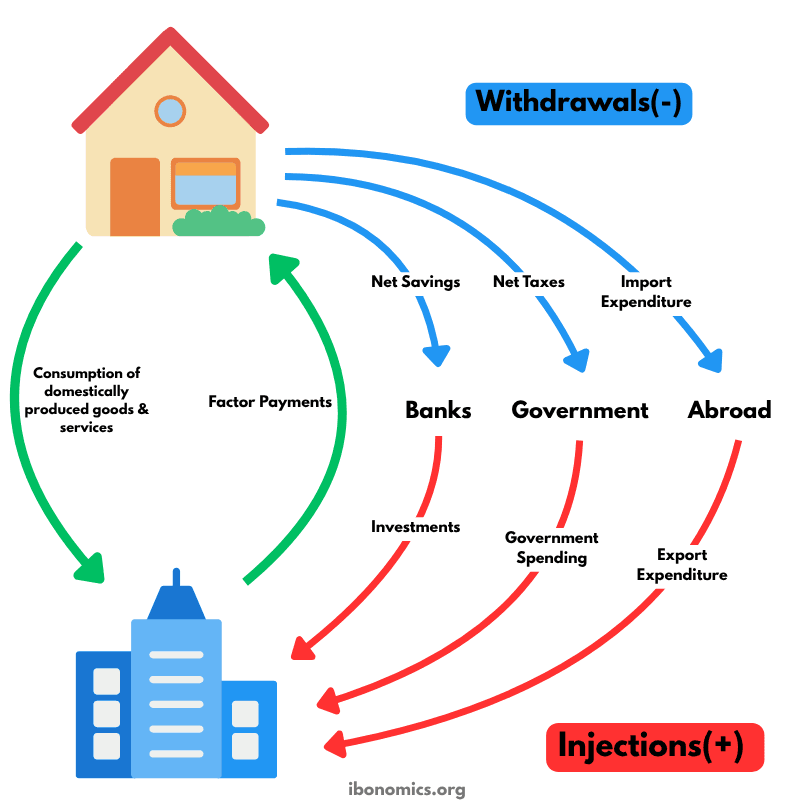
A refined circular flow model highlighting the roles of injections and withdrawals in determining national income and economic equilibrium.
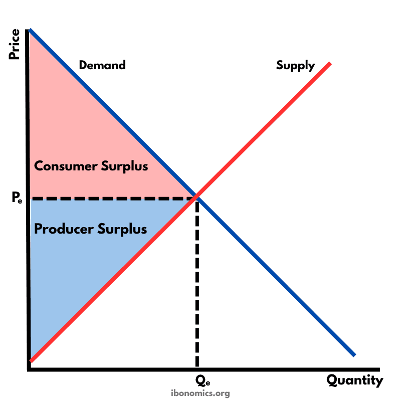
A diagram illustrating consumer surplus and producer surplus in a competitive market, showing the benefits to buyers and sellers at the market equilibrium.
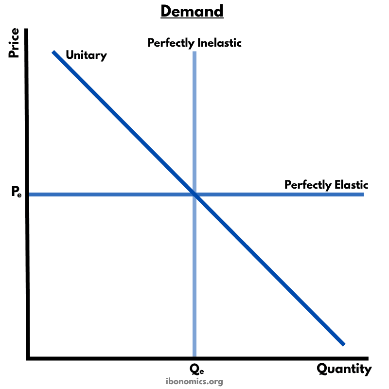
A diagram illustrating different types of price elasticity of demand: perfectly inelastic, perfectly elastic, and unitary elastic demand curves.
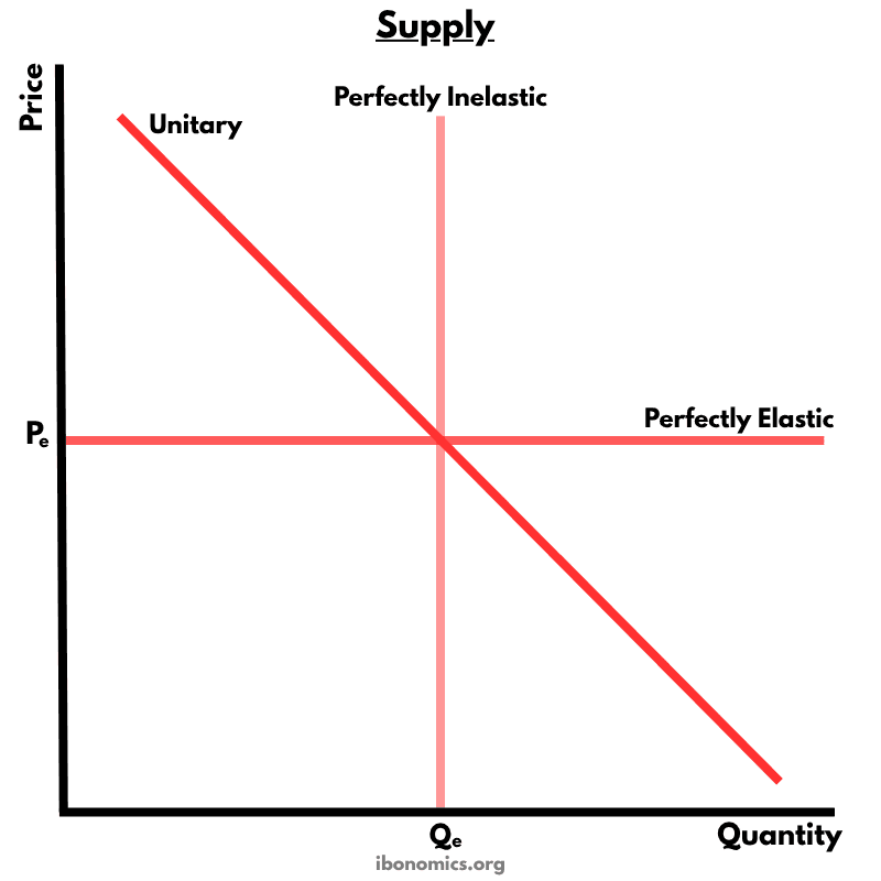
A diagram illustrating different types of price elasticity of supply: perfectly inelastic, perfectly elastic, and unitary elastic supply curves.
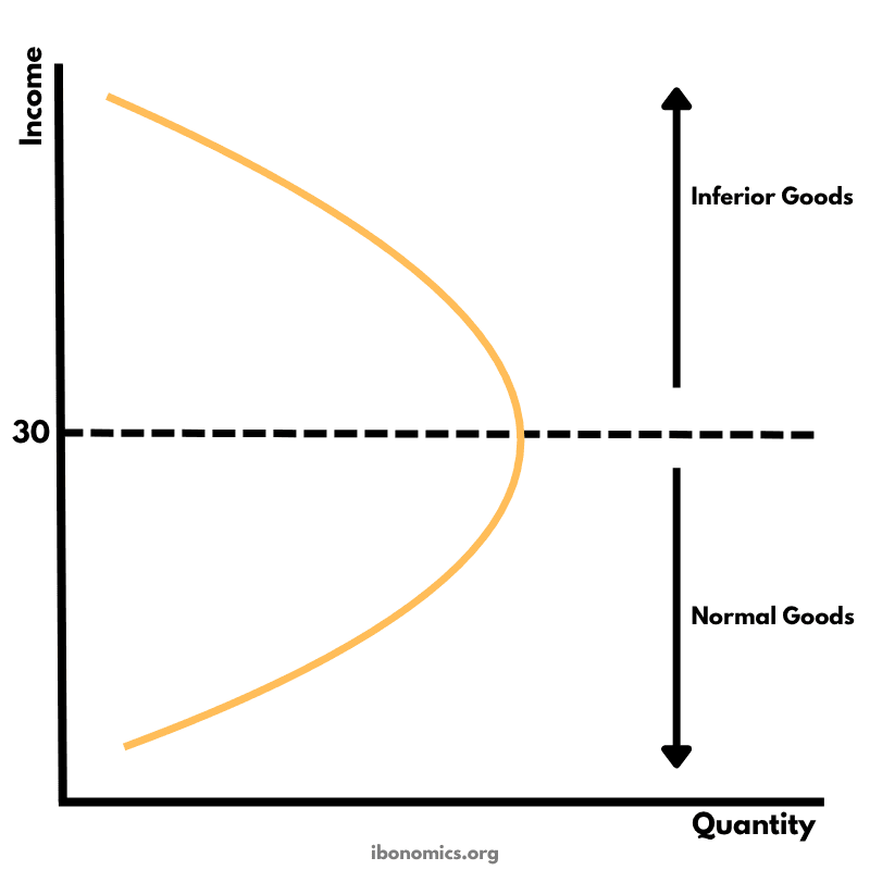
The Engel Curve illustrates how the quantity demanded of a good changes as consumer income changes, distinguishing between normal and inferior goods.
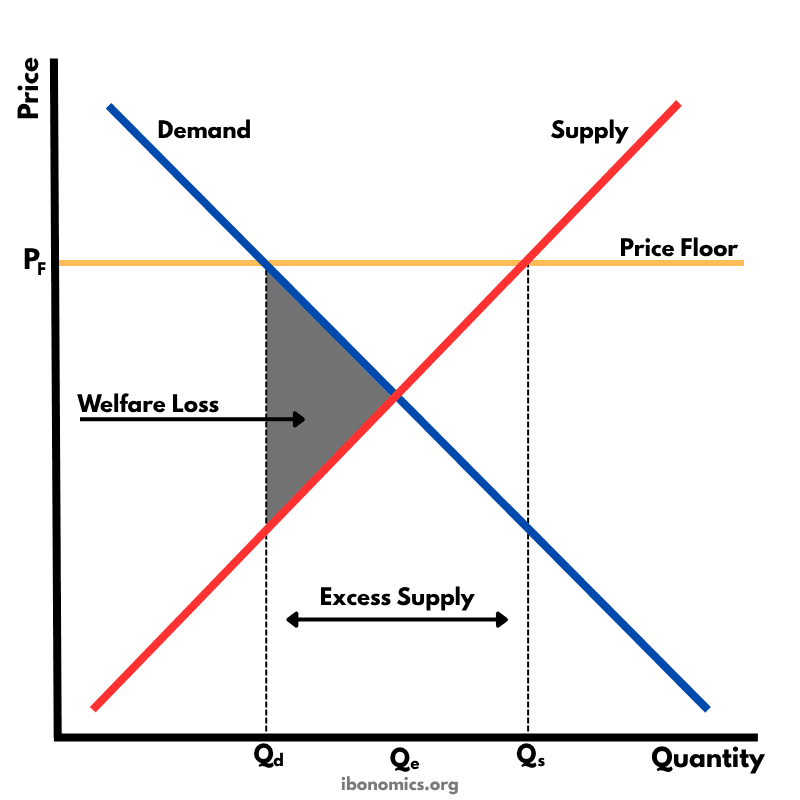
A diagram showing the effects of a price floor set above equilibrium, resulting in excess supply and welfare loss in the market.
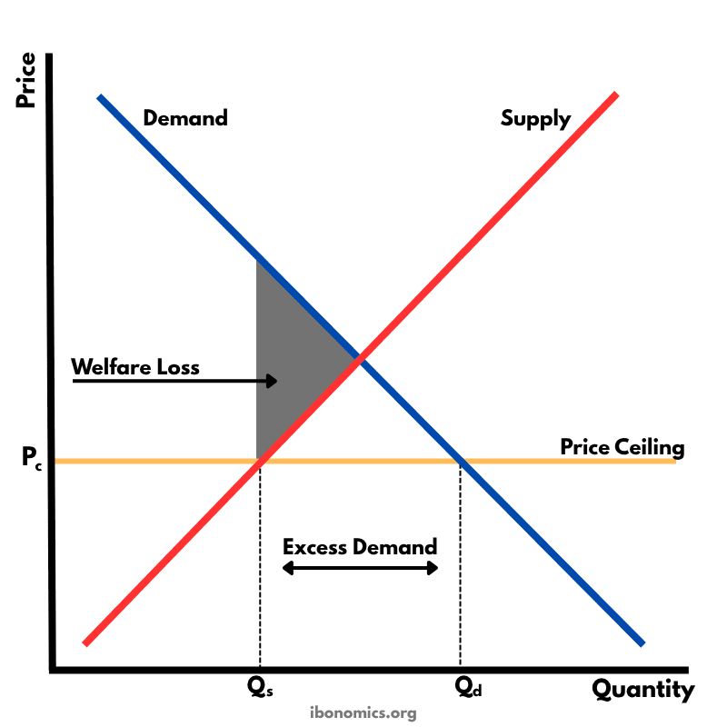
A diagram showing the effects of a price ceiling set below the market equilibrium price, resulting in excess demand and welfare loss.
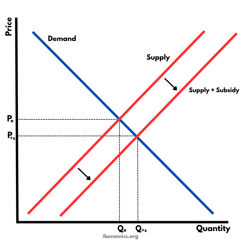
A diagram showing the effect of a government subsidy on a market, resulting in a downward shift of the supply curve, lower price for consumers, and increased quantity supplied.
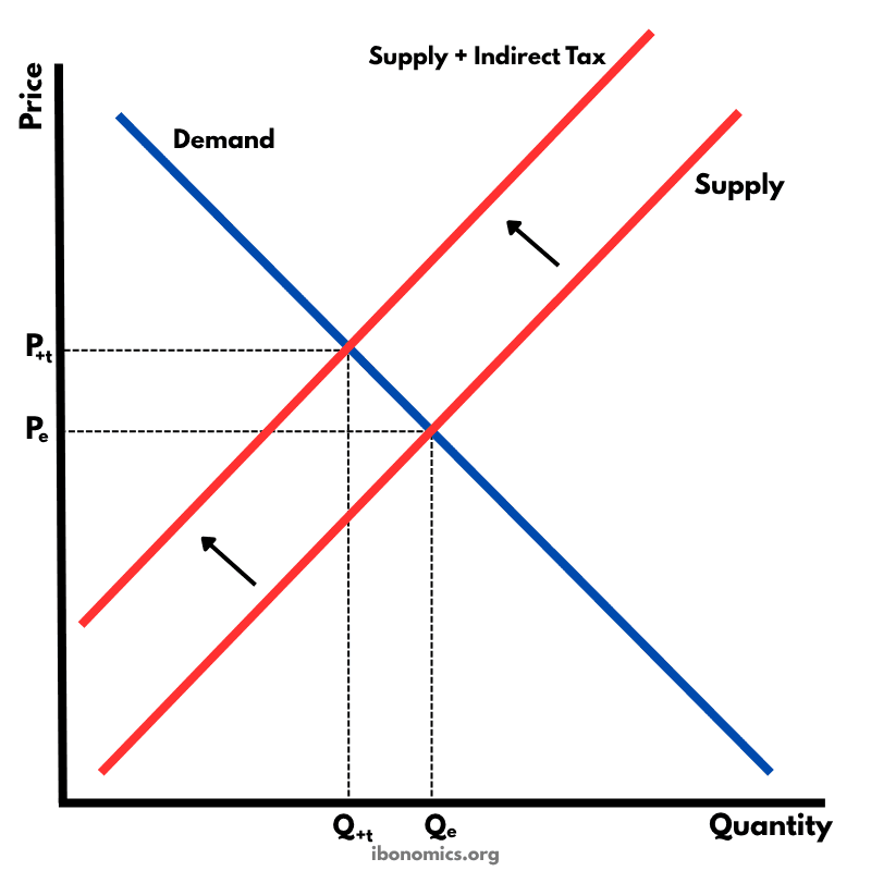
A diagram showing the effects of an indirect tax on a market, resulting in a leftward shift of the supply curve, higher price for consumers, lower quantity traded, and a reduction in market efficiency.
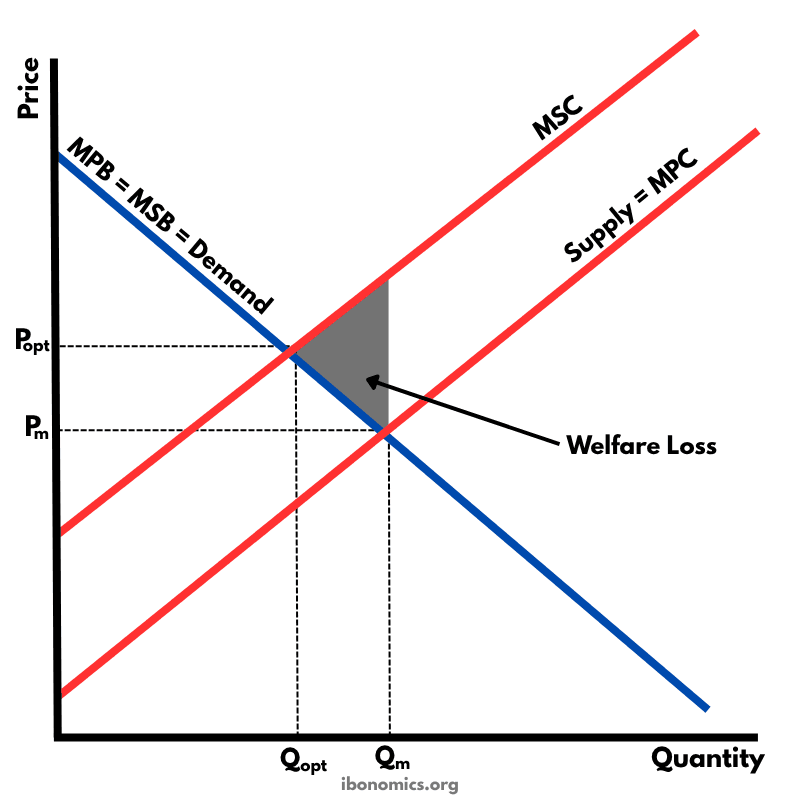
A diagram illustrating a negative externality of production, where the marginal social cost (MSC) exceeds the marginal private cost (MPC), leading to overproduction and welfare loss.
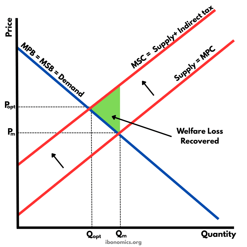
A diagram illustrating how a Pigouvian tax corrects a negative externality of production by internalising external costs, shifting supply from MPC to MSC and reducing overproduction.
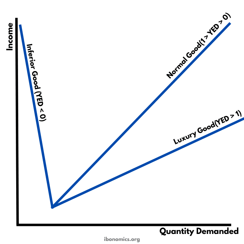
A diagram illustrating different values of income elasticity of demand (YED) and how quantity demanded responds to changes in income for inferior, normal, and luxury goods.
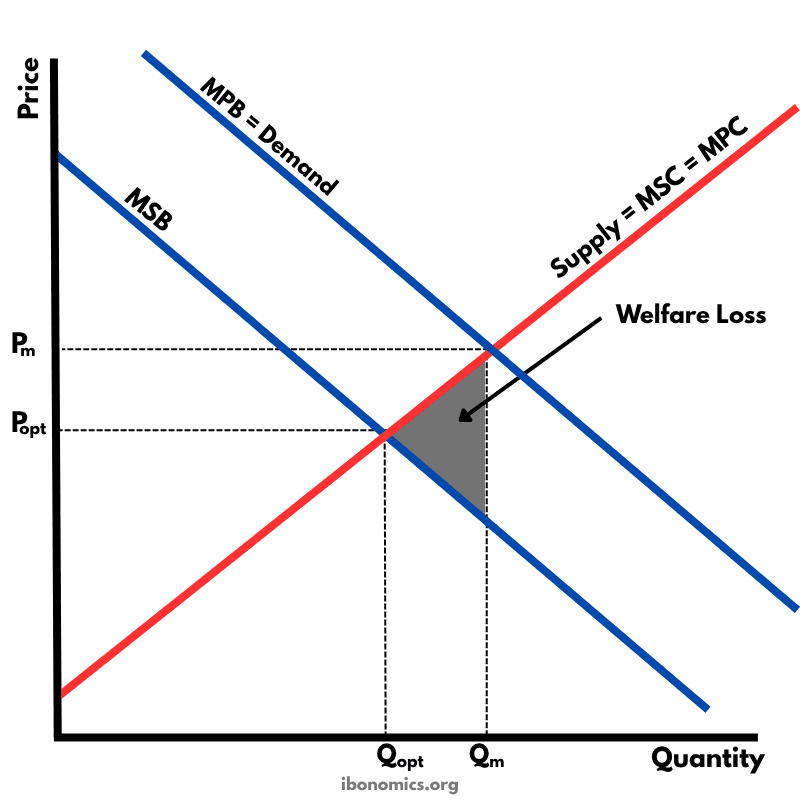
A diagram illustrating a negative externality of consumption, where the marginal social benefit (MSB) is lower than the marginal private benefit (MPB), leading to overconsumption and welfare loss.
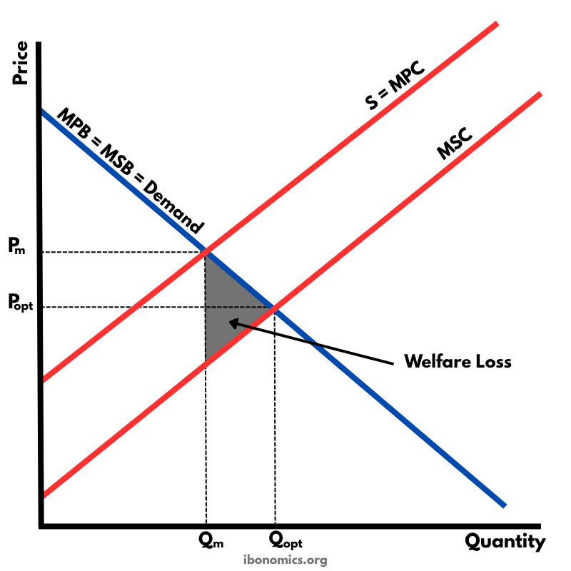
A diagram illustrating a positive externality of production, where the marginal social cost (MSC) is lower than the marginal private cost (MPC), leading to underproduction and welfare loss.
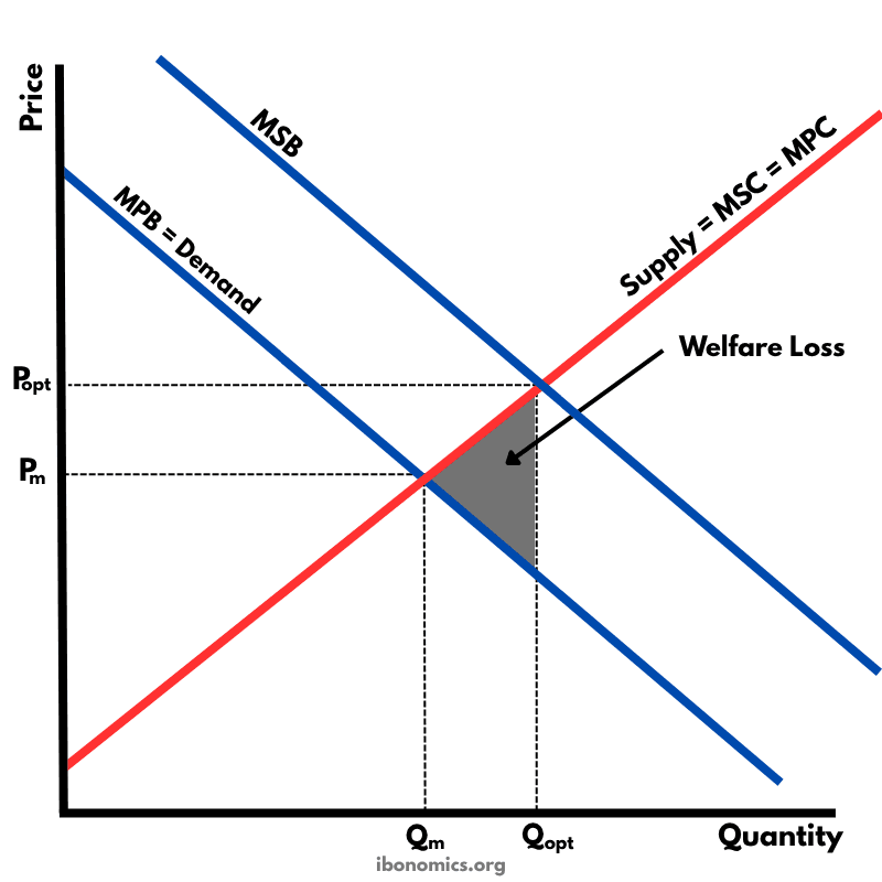
A diagram illustrating a positive externality of consumption, where the marginal social benefit (MSB) exceeds the marginal private benefit (MPB), leading to underconsumption and welfare loss.
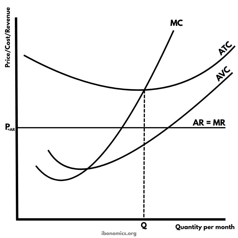
A diagram illustrating a perfectly competitive firm's short-run position where price equals average revenue but is below average total cost, resulting in a loss.
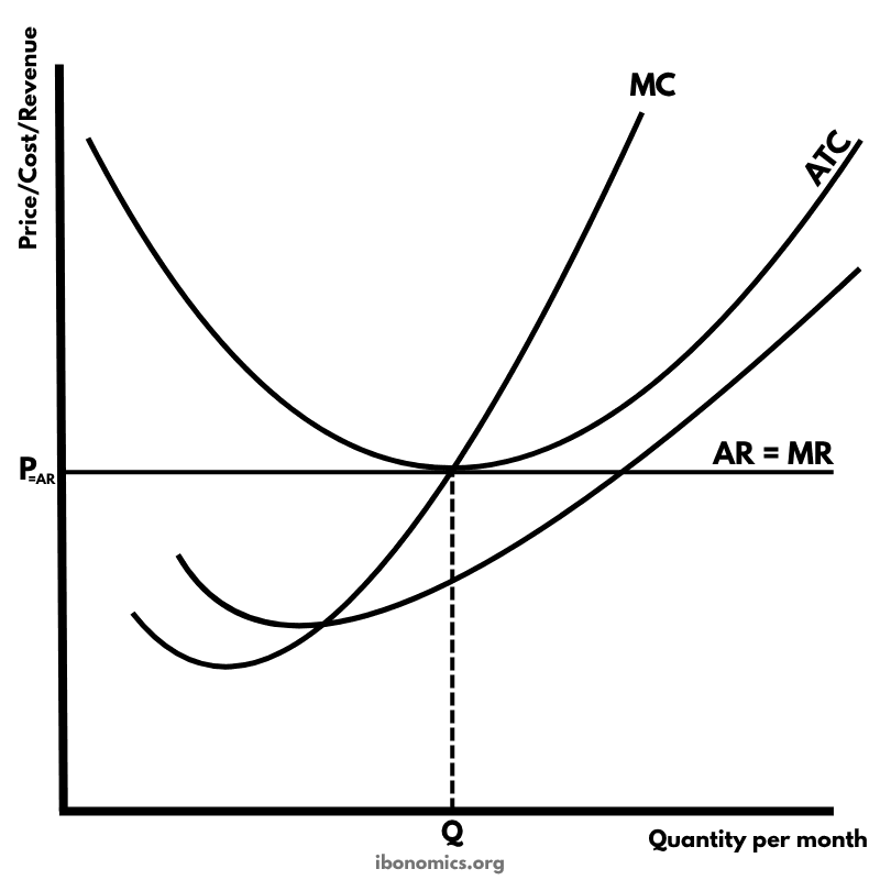
A diagram illustrating a perfectly competitive firm in long-run equilibrium, where economic profit is zero, and the firm is operating at its most efficient scale.
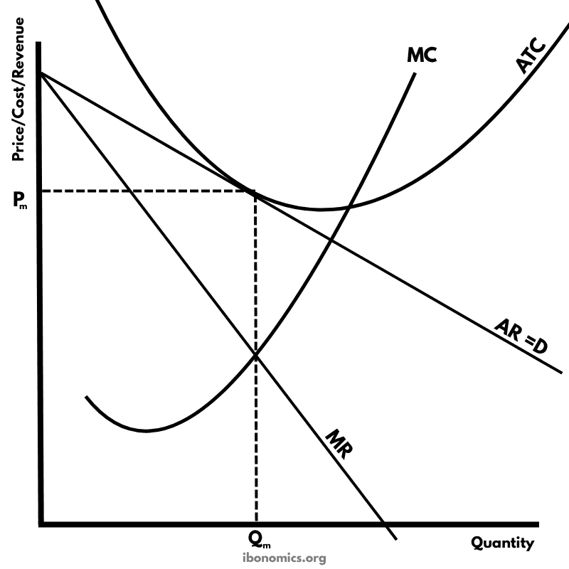
A diagram illustrating a firm in monopolistic competition in long-run equilibrium, where it earns normal profit. The ATC curve is tangent to the demand curve (AR), meaning total revenue equals total cost.
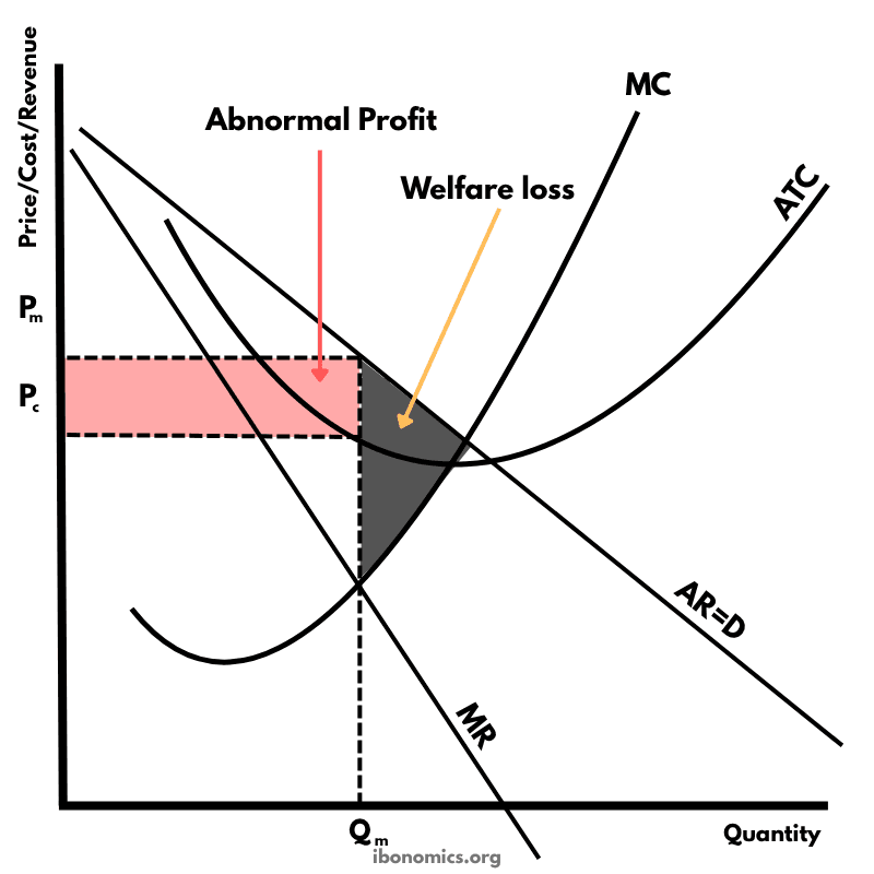
A diagram illustrating a monopolist earning abnormal profit. The firm restricts output to Qm where MC = MR and sets price Pm, resulting in welfare loss and consumer surplus loss compared to a perfectly competitive outcome.
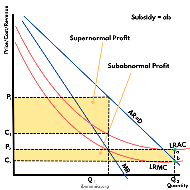
A diagram illustrating a natural monopoly regulated to achieve allocative efficiency through subsidies. It highlights supernormal and subabnormal profit regions, along with the required subsidy to sustain production at the socially optimal quantity.
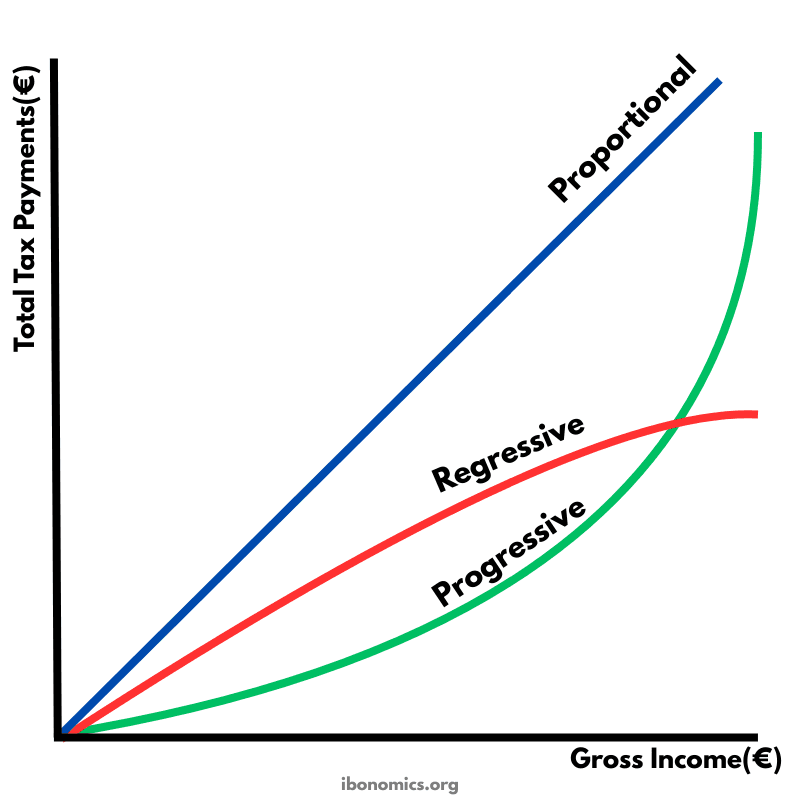
This diagram compares three tax systems by showing how total tax payments change as gross income rises. The shape of each line shows whether tax payments increase at a constant rate, faster than income, or slower than income. This helps illustrate how the tax burden is shared across low and high income earners in proportional, progressive, and regressive tax systems.
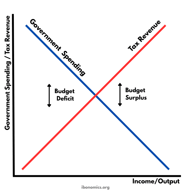
This diagram illustrates automatic stabilisers by showing how tax revenue and government spending change automatically as national income (real GDP) changes. When income rises, tax revenue increases and some types of government spending fall, which reduces inflationary pressure. When income falls, tax revenue decreases and government spending rises, which supports aggregate demand. These automatic changes help smooth fluctuations in economic growth without new government policy decisions.
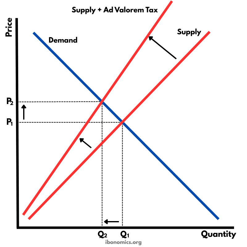
This diagram illustrates the effect of an ad valorem (percentage) tax on producers. Unlike a specific tax which shifts the supply curve upward in a parallel way, an ad valorem tax causes the supply curve to pivot and become steeper. As price rises, the tax amount increases proportionally, leading to a higher final price for consumers and a lower equilibrium quantity.

This diagram illustrates a carbon emissions trading system (cap and trade). The government sets a fixed number of emission permits that firms can buy and sell in a market. The vertical supply curve represents the total quantity of permits allowed by the government (the cap). Firms demand permits because they need them in order to produce while emitting carbon. The intersection of demand and supply determines the equilibrium price of emission permits (Pe) and the quantity of permits traded (Qe). This market mechanism creates a financial incentive for firms to reduce pollution because firms that can reduce emissions cheaply will buy fewer permits or sell their excess permits to other firms.