Engel Curve (Normal and Inferior Goods)
Microeconomics
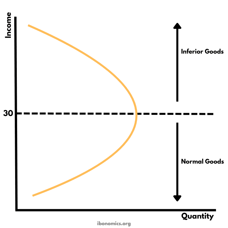
The Engel Curve illustrates how the quantity demanded of a good changes as consumer income changes, distinguishing between normal and inferior goods.
Curves and Elements
engel curve
Engel Curve: Illustrates how the quantity demanded of a good changes in response to changes in consumer income.
normal goods
Normal Goods: Demand increases with rising income. Represented by the upward-sloping section of the curve.
inferior goods
Inferior Goods: Demand decreases with rising income. Represented by the downward-sloping section of the curve.
The curve shows the relationship between a consumer's income and the quantity of a good they purchase.
For normal goods, as income increases, quantity demanded also increases — shown by the upward-sloping section of the curve below income level 30.
For inferior goods, quantity demanded decreases as income increases — seen in the downward-sloping section above income level 30.
Goods may switch from being normal to inferior at a certain income threshold, depending on consumer preferences.
Understanding Engel curves helps policymakers and businesses predict changes in demand as income levels shift across the economy.
More Microeconomics Diagrams
Explore other diagrams from the same unit to deepen your understanding
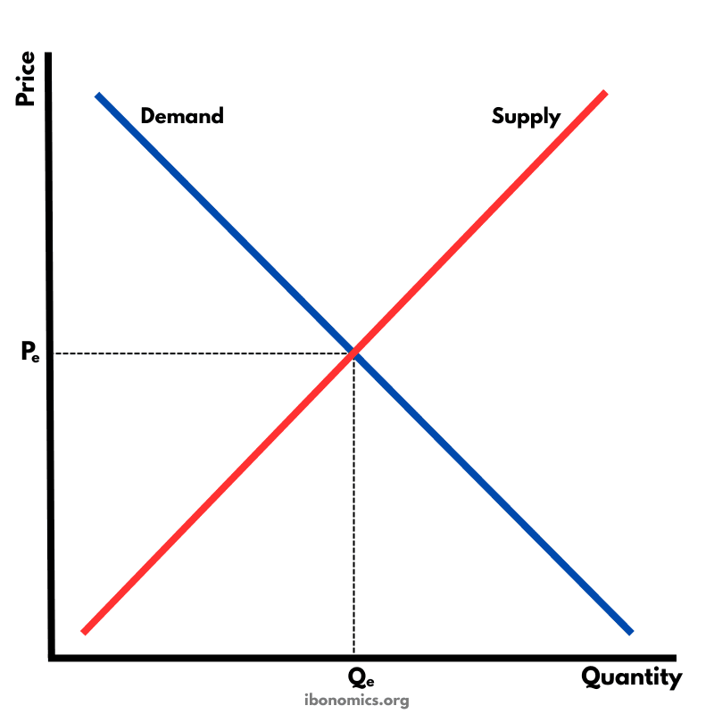
The fundamental diagram showing the relationship between demand and supply in a competitive market, determining equilibrium price and quantity.
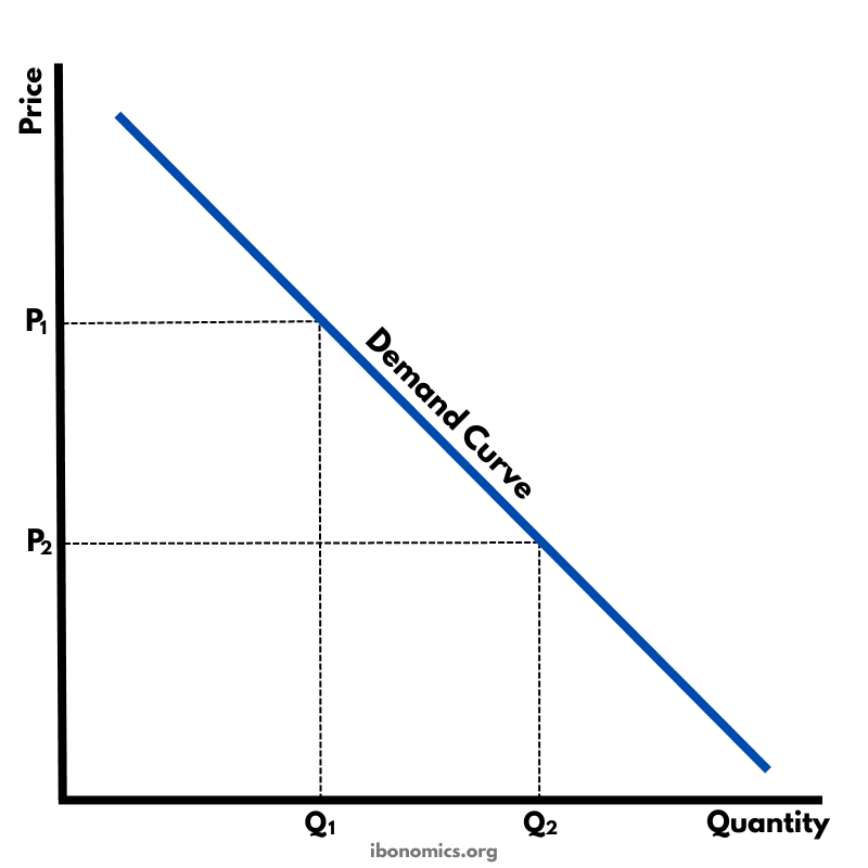
A basic diagram showing the inverse relationship between price and quantity demanded, illustrating the law of demand.
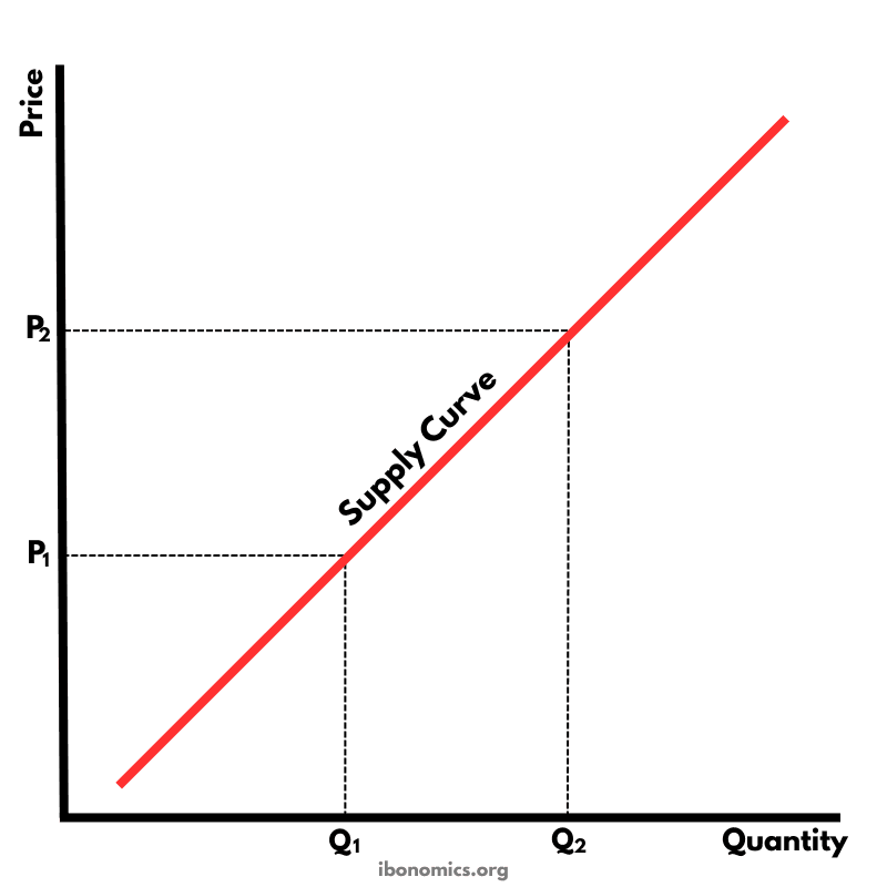
A basic diagram showing the positive relationship between price and quantity supplied, illustrating the law of supply.
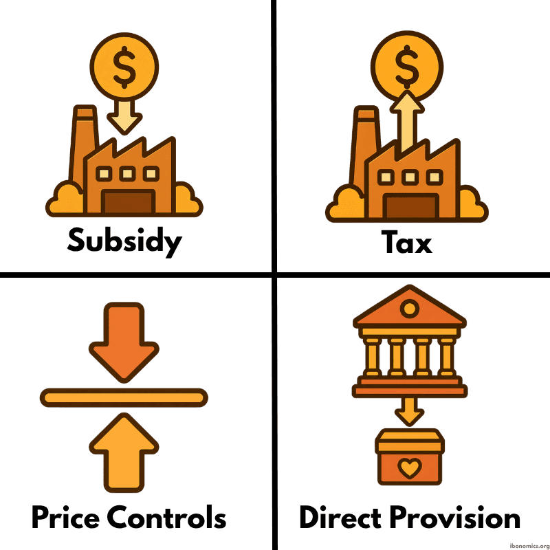
A simple diagram showing four common forms of government intervention in markets: subsidies, taxes, price controls, and direct provision.
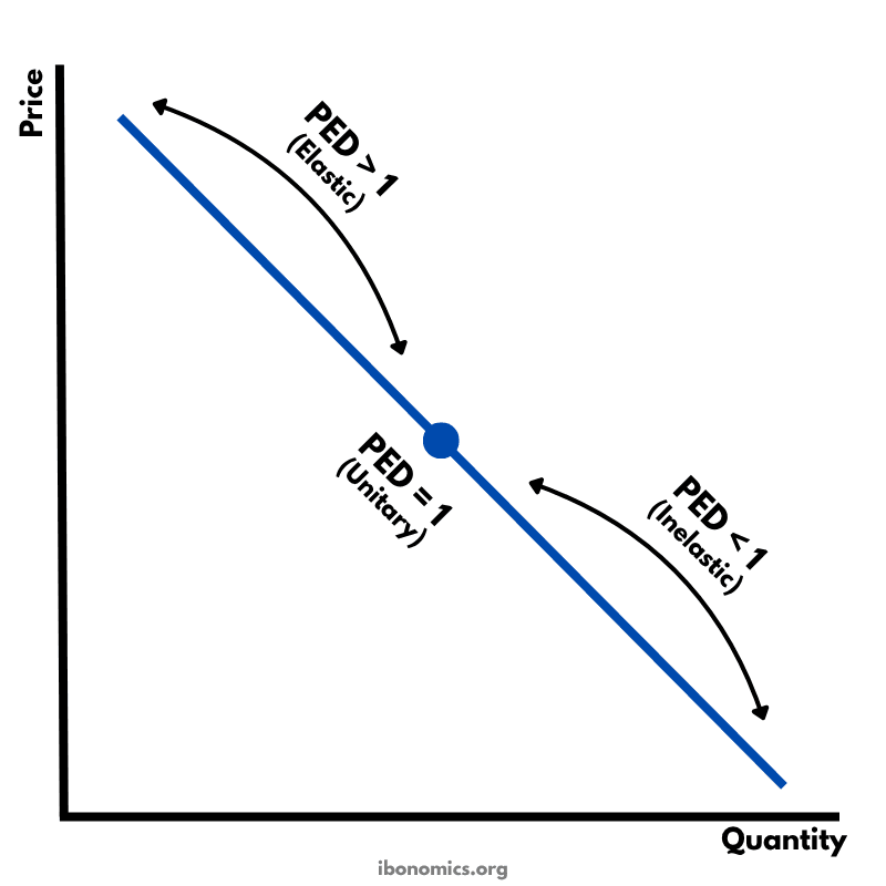
A diagram showing how price elasticity of demand changes along a straight-line demand curve, from elastic to unitary elastic to inelastic.
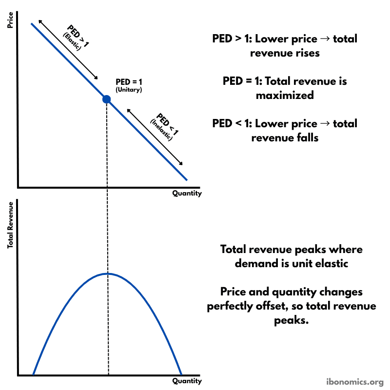
A diagram showing how price elasticity of demand affects total revenue, with total revenue maximized where demand is unitary elastic.