Demand Curve
Microeconomics
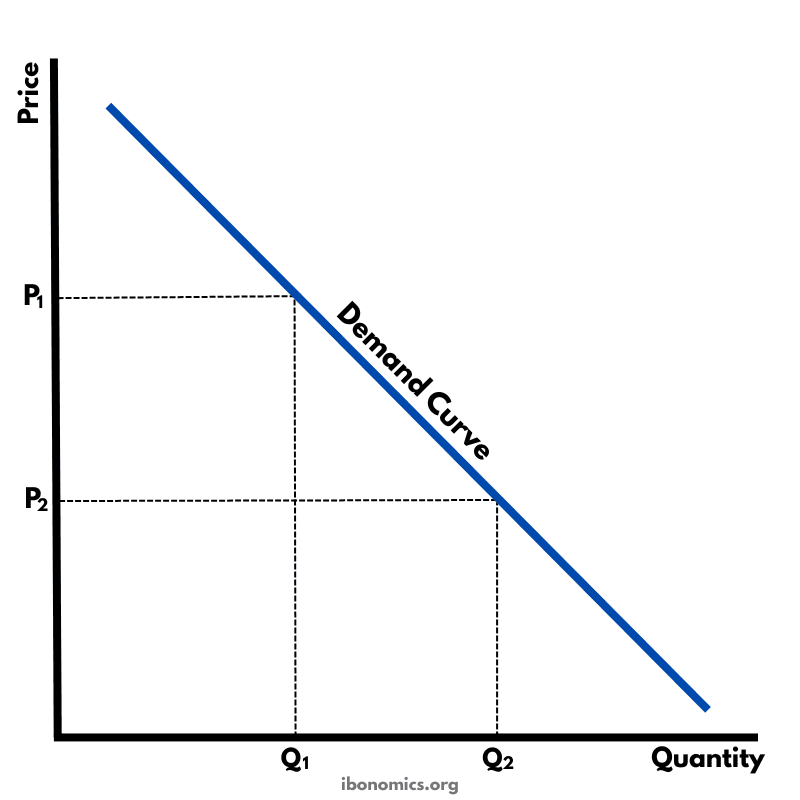
A basic diagram showing the inverse relationship between price and quantity demanded, illustrating the law of demand.
Curves and Elements
demand
Demand Curve (D): Shows the inverse relationship between price and quantity demanded. Slopes downward from left to right.
price change
Price Change: A fall in price from P1 to P2 causes movement along the demand curve.
quantity change
Quantity Change: Quantity demanded increases from Q1 to Q2 as price decreases.
The demand curve slopes downward from left to right, showing that consumers demand more of a good at lower prices.
When price falls from P1 to P2, quantity demanded increases from Q1 to Q2.
This movement along the demand curve is caused by a change in price, not a shift in demand.
The inverse relationship between price and quantity demanded is known as the law of demand.
More Microeconomics Diagrams
Explore other diagrams from the same unit to deepen your understanding
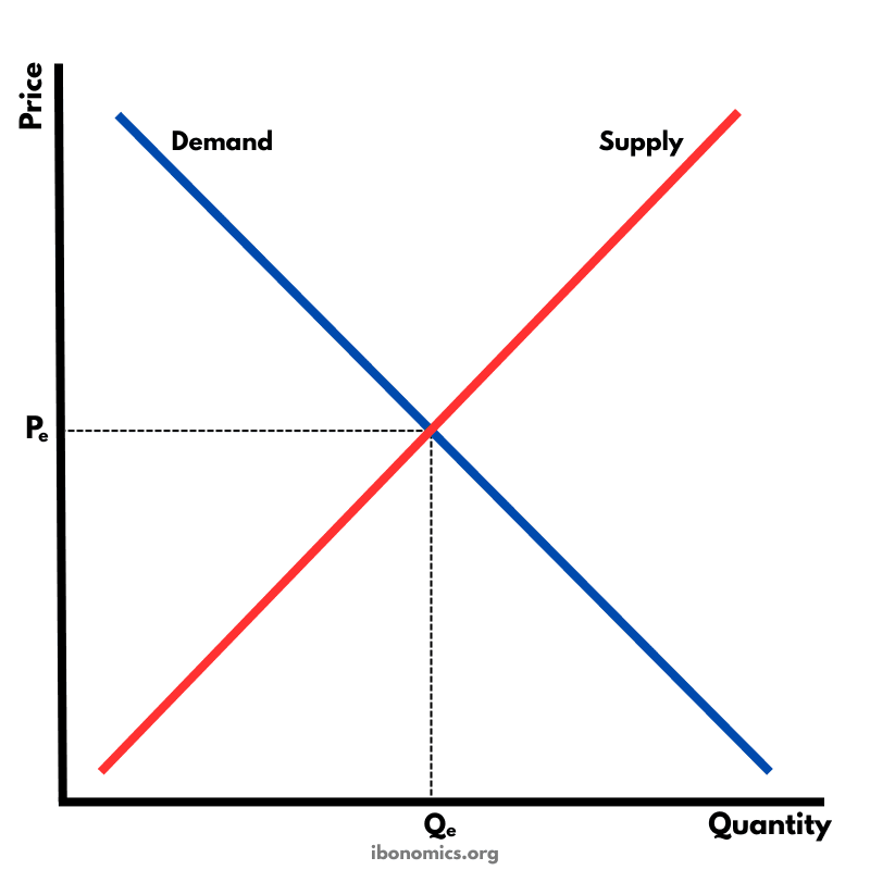
The fundamental diagram showing the relationship between demand and supply in a competitive market, determining equilibrium price and quantity.
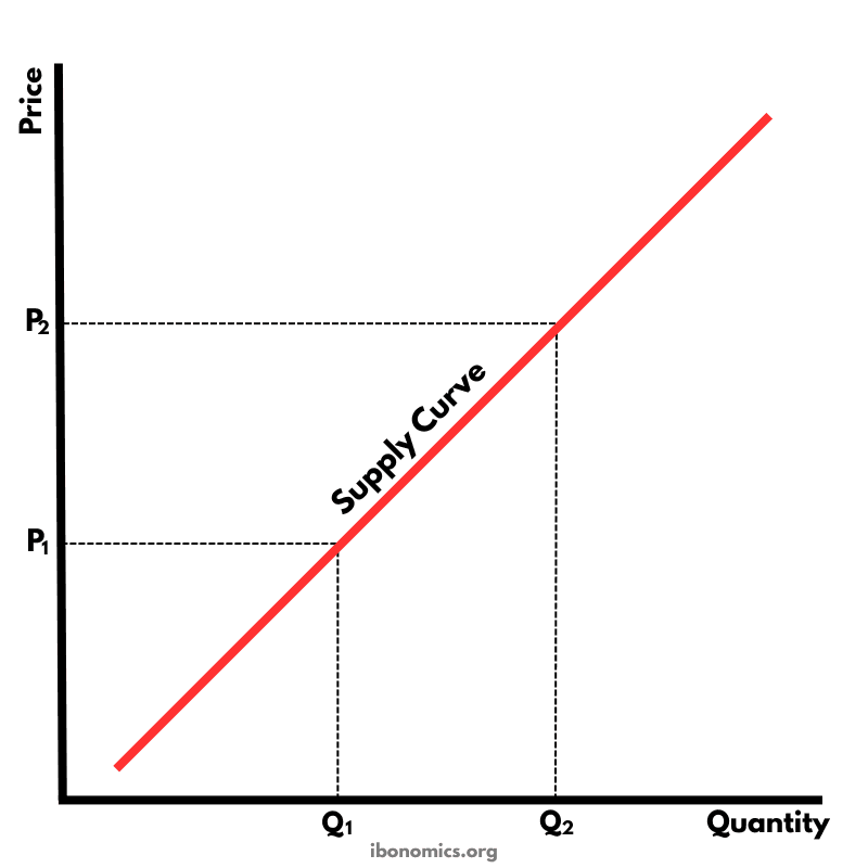
A basic diagram showing the positive relationship between price and quantity supplied, illustrating the law of supply.
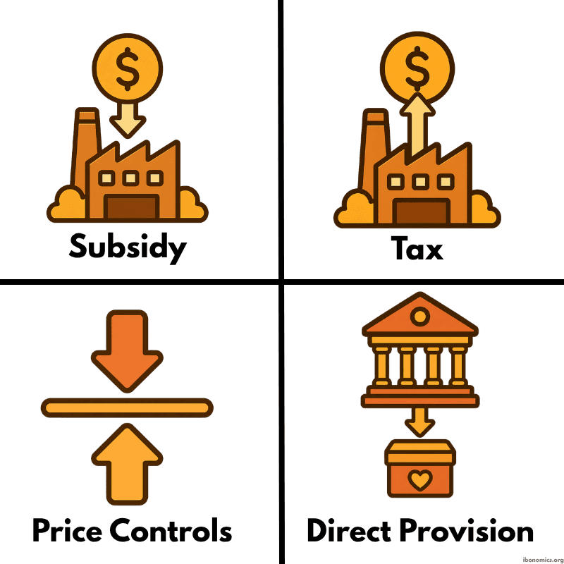
A simple diagram showing four common forms of government intervention in markets: subsidies, taxes, price controls, and direct provision.
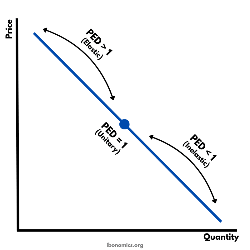
A diagram showing how price elasticity of demand changes along a straight-line demand curve, from elastic to unitary elastic to inelastic.
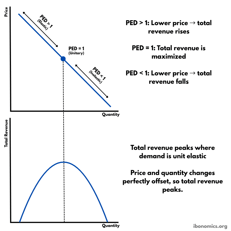
A diagram showing how price elasticity of demand affects total revenue, with total revenue maximized where demand is unitary elastic.
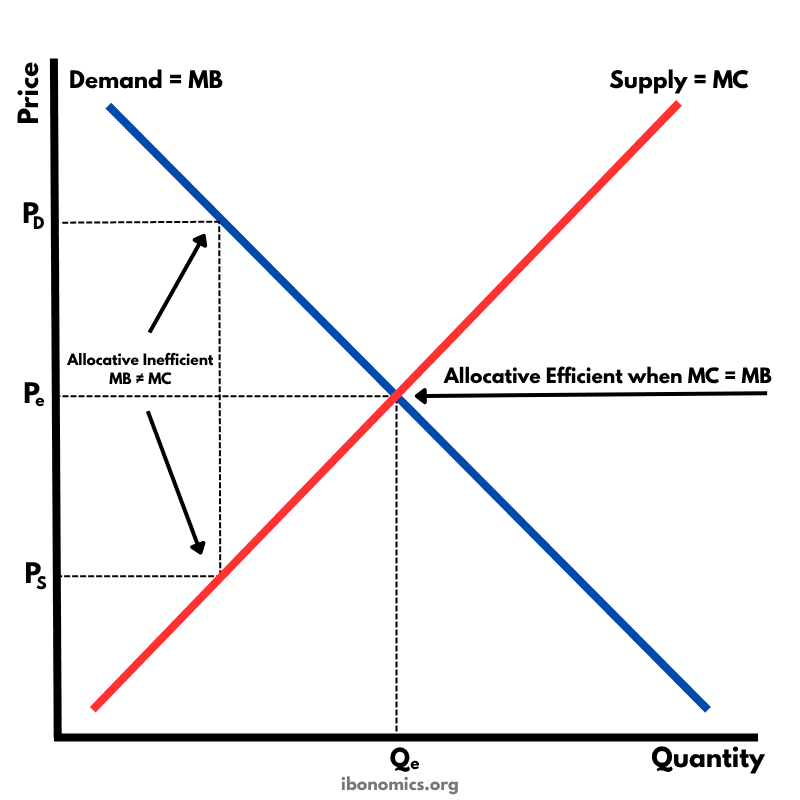
A diagram showing that allocative efficiency occurs where marginal benefit equals marginal cost, meaning resources are allocated to maximize welfare.