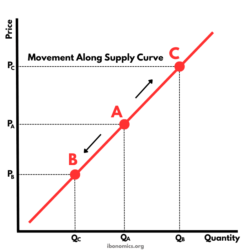
Movement Along the Supply Curve
Microeconomics
A diagram showing movements along a supply curve caused by changes in the price of the good itself.
Curves and Elements
supply
Supply Curve (S): Shows the positive relationship between price and quantity supplied.
point a
Point A: The original position on the supply curve at price PA and quantity QA.
extension
Extension in Supply (A to C): A movement up the supply curve caused by a rise in price from PA to PC.
contraction
Contraction in Supply (A to B): A movement down the supply curve caused by a fall in price from PA to PB.
price change
Price Change: A change in the good’s own price causes movement along the supply curve rather than a shift of the curve.
A movement along the supply curve occurs when the good’s own price changes.
A rise in price from PA to PC causes an extension in supply, moving from point A to point C.
A fall in price from PA to PB causes a contraction in supply, moving from point A to point B.
Only price changes cause movement along the supply curve; non-price factors shift the whole supply curve.
More Microeconomics Diagrams
Explore other diagrams from the same unit to deepen your understanding
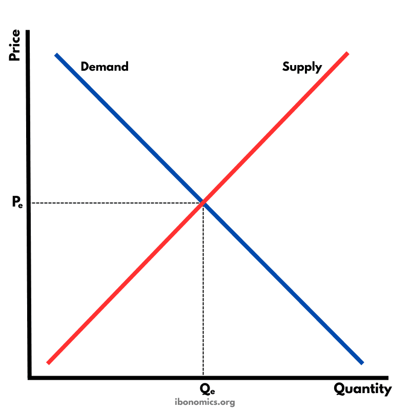
The fundamental diagram showing the relationship between demand and supply in a competitive market, determining equilibrium price and quantity.
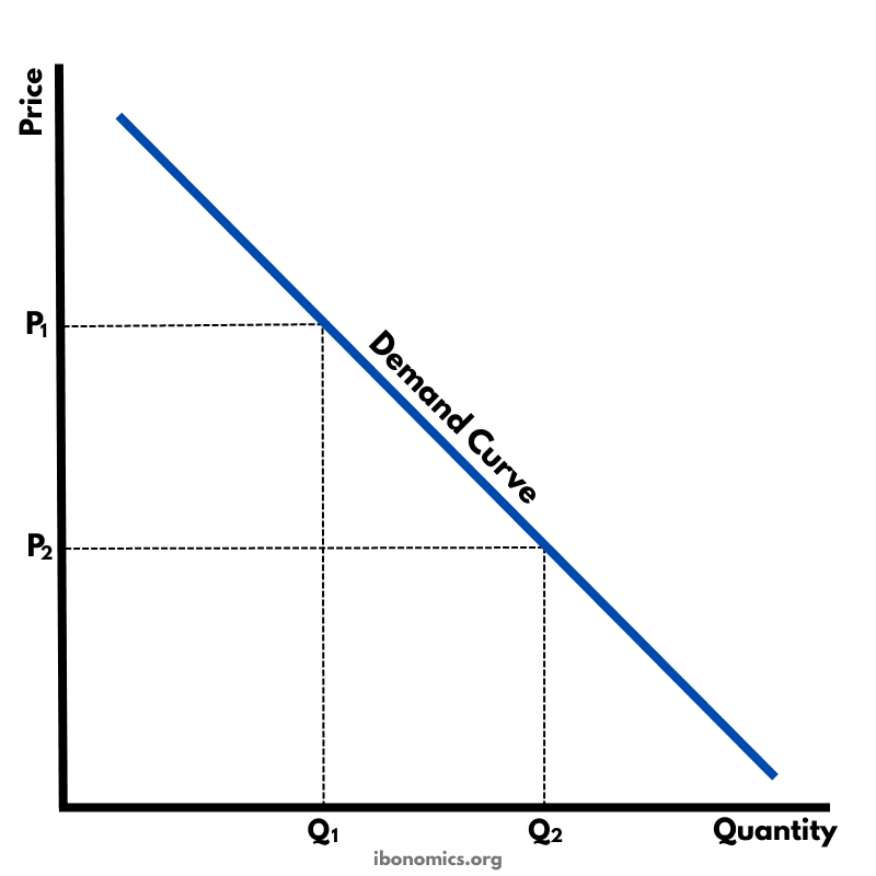
A basic diagram showing the inverse relationship between price and quantity demanded, illustrating the law of demand.
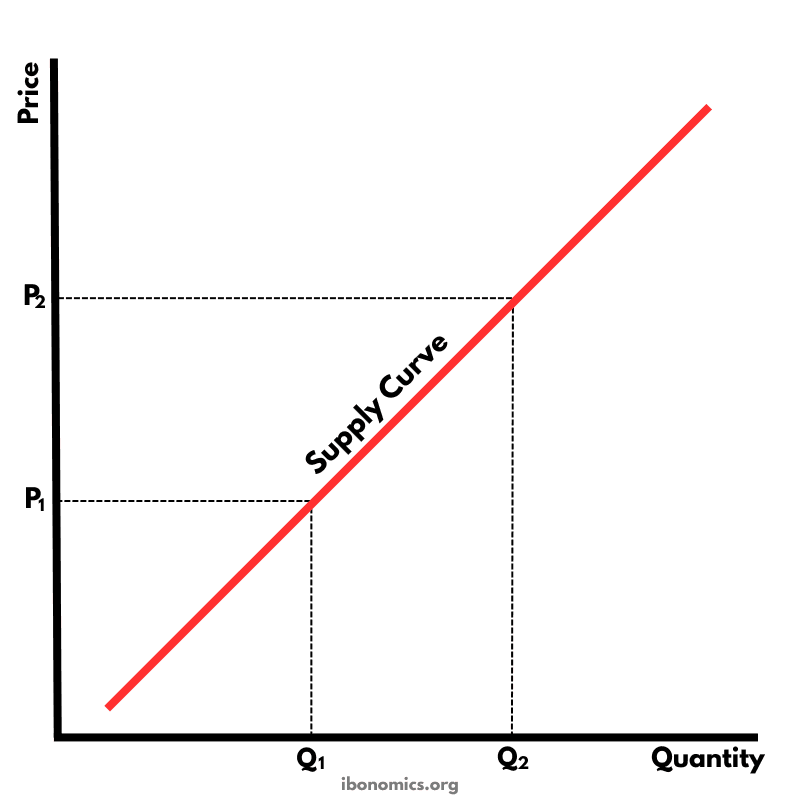
A basic diagram showing the positive relationship between price and quantity supplied, illustrating the law of supply.
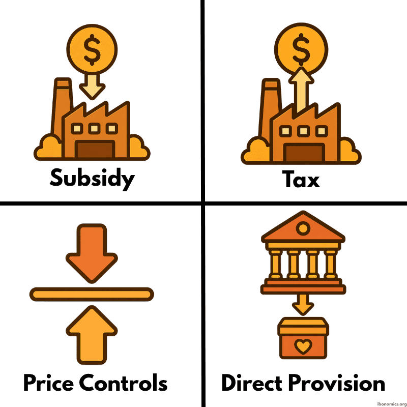
A simple diagram showing four common forms of government intervention in markets: subsidies, taxes, price controls, and direct provision.
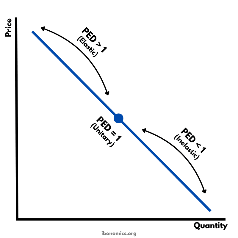
A diagram showing how price elasticity of demand changes along a straight-line demand curve, from elastic to unitary elastic to inelastic.
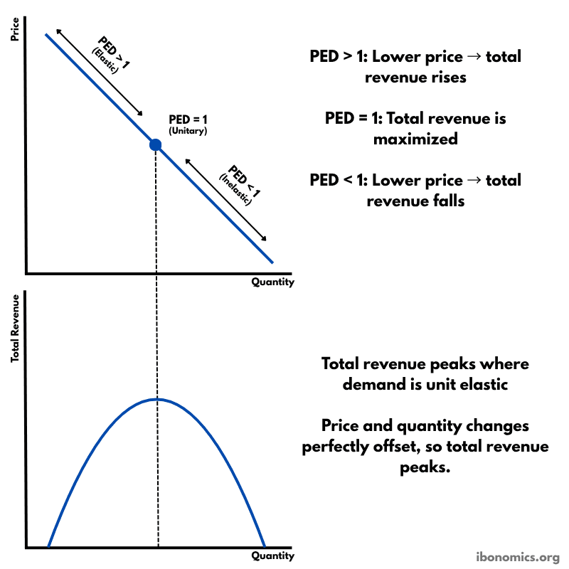
A diagram showing how price elasticity of demand affects total revenue, with total revenue maximized where demand is unitary elastic.