Consumer and Producer Surplus
Microeconomics
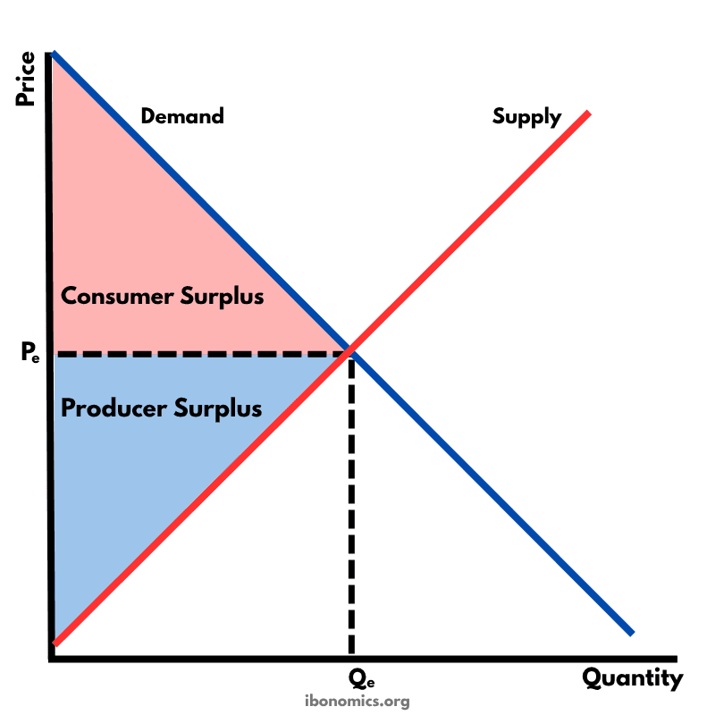
A diagram illustrating consumer surplus and producer surplus in a competitive market, showing the benefits to buyers and sellers at the market equilibrium.
Curves and Elements
demand
Demand Curve: Slopes downward, showing the inverse relationship between price and quantity demanded.
supply
Supply Curve: Slopes upward, showing the direct relationship between price and quantity supplied.
equilibrium
Equilibrium Point (Pe, Qe): The intersection of demand and supply curves, where quantity demanded equals quantity supplied.
consumer surplus
Consumer Surplus: The area above the price level and below the demand curve — represents extra benefit to consumers.
producer surplus
Producer Surplus: The area below the price level and above the supply curve — represents extra benefit to producers.
The market reaches equilibrium where the demand and supply curves intersect, at price Pe and quantity Qe.
Consumer surplus is the area above the equilibrium price and below the demand curve — it represents the extra benefit consumers receive when they are willing to pay more than the market price.
Producer surplus is the area below the equilibrium price and above the supply curve — it represents the extra benefit producers receive when they sell at a higher price than their minimum acceptable price.
The total economic surplus (consumer + producer surplus) is maximized at equilibrium, indicating allocative efficiency.
Any shift in demand or supply, or government intervention (e.g. price controls, taxes), can reduce total surplus and create deadweight loss.
More Microeconomics Diagrams
Explore other diagrams from the same unit to deepen your understanding
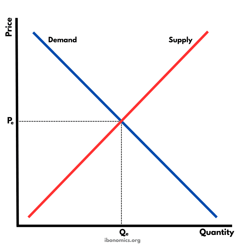
The fundamental diagram showing the relationship between demand and supply in a competitive market, determining equilibrium price and quantity.
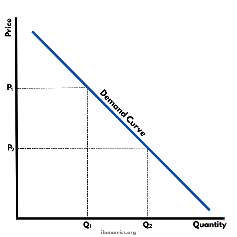
A basic diagram showing the inverse relationship between price and quantity demanded, illustrating the law of demand.
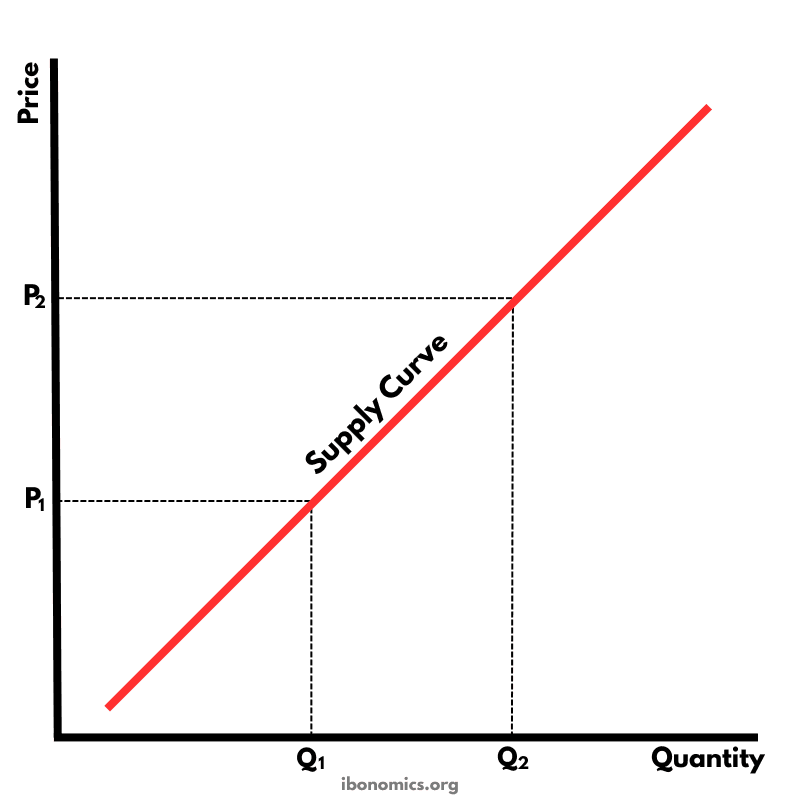
A basic diagram showing the positive relationship between price and quantity supplied, illustrating the law of supply.
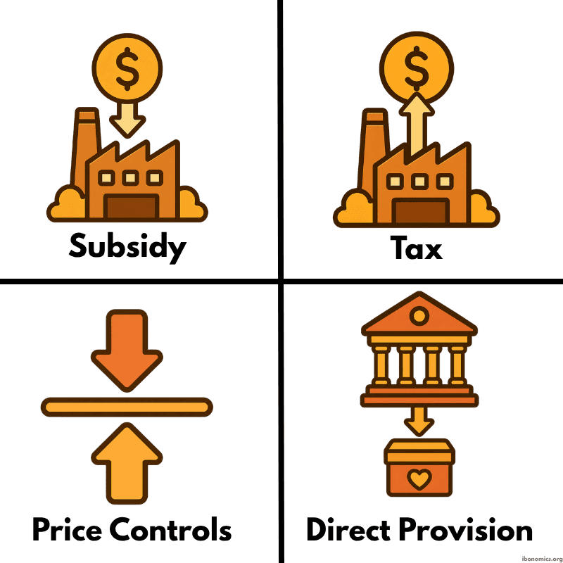
A simple diagram showing four common forms of government intervention in markets: subsidies, taxes, price controls, and direct provision.
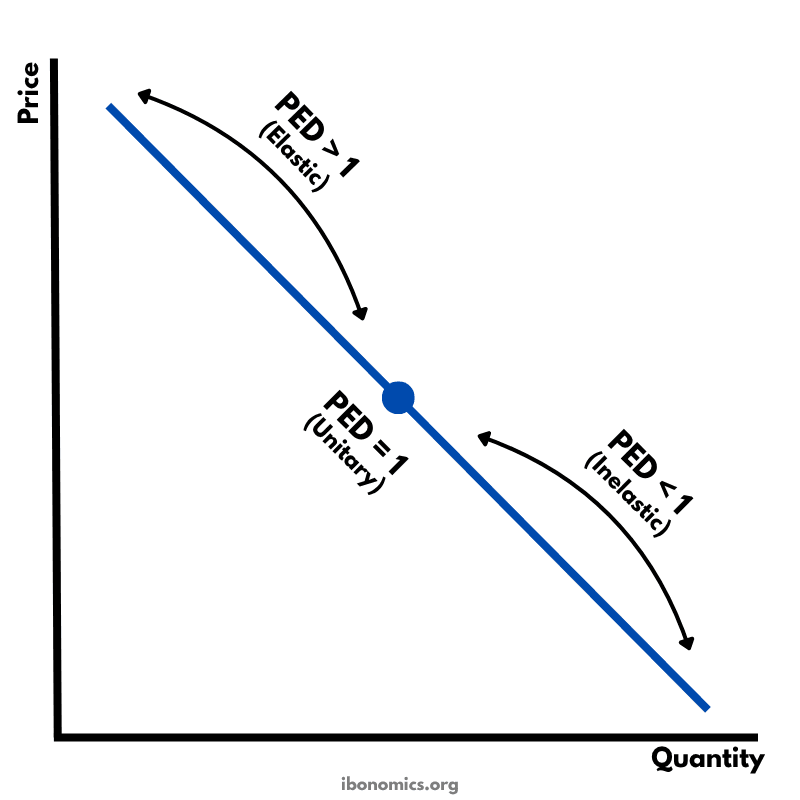
A diagram showing how price elasticity of demand changes along a straight-line demand curve, from elastic to unitary elastic to inelastic.
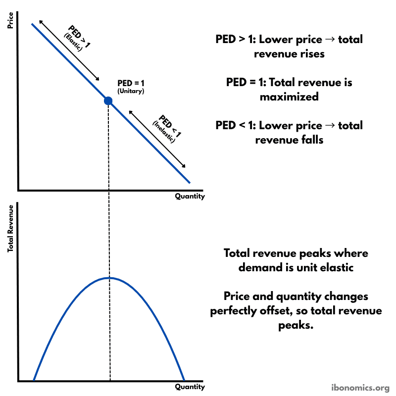
A diagram showing how price elasticity of demand affects total revenue, with total revenue maximized where demand is unitary elastic.