Negative Externality of Production
Microeconomics
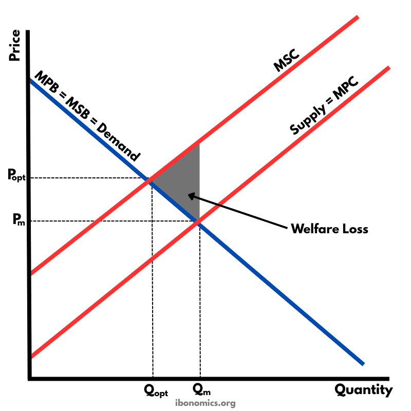
A diagram illustrating a negative externality of production, where the marginal social cost (MSC) exceeds the marginal private cost (MPC), leading to overproduction and welfare loss.
Curves and Elements
demand
Demand Curve (MPB = MSB): Represents both marginal private benefit and marginal social benefit under the assumption there are no externalities in consumption.
mpc
MPC (Supply): Marginal private cost — the cost borne by producers only.
msc
MSC: Marginal social cost — the true cost to society, including external costs.
price effect
Price Effect: The market price (Pm) is lower than the socially optimal price (Popt).
quantity effect
Quantity Effect: The market produces more (Qm) than the socially optimal quantity (Qopt).
welfare loss
Welfare Loss: The triangle representing the deadweight loss due to the misallocation of resources caused by the externality.
Negative externalities of production occur when a firm’s production imposes external costs on third parties, such as pollution, without being reflected in market prices.
In the free market equilibrium, the firm produces at Qm where marginal private cost (MPC) = marginal private benefit (MPB), resulting in price Pm.
However, the socially optimal level of output is Qopt, where marginal social cost (MSC) = marginal social benefit (MSB).
Because MSC > MPC, the market overproduces (Qm > Qopt), and too many resources are allocated to the good.
The shaded triangle represents the welfare loss — the cost to society of the externality that is not accounted for in the market outcome.
More Microeconomics Diagrams
Explore other diagrams from the same unit to deepen your understanding
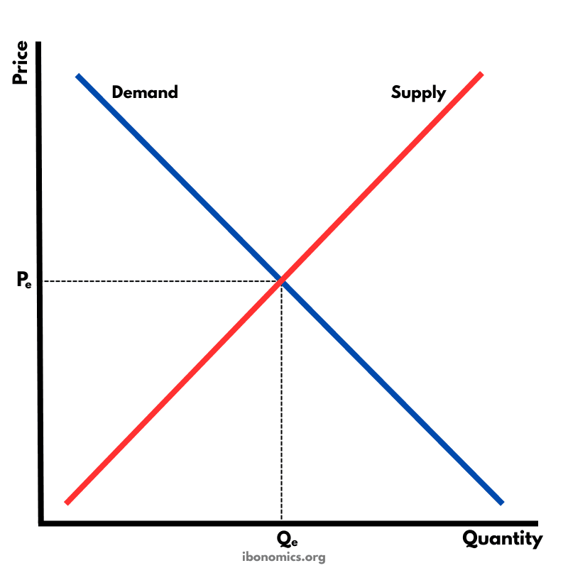
The fundamental diagram showing the relationship between demand and supply in a competitive market, determining equilibrium price and quantity.
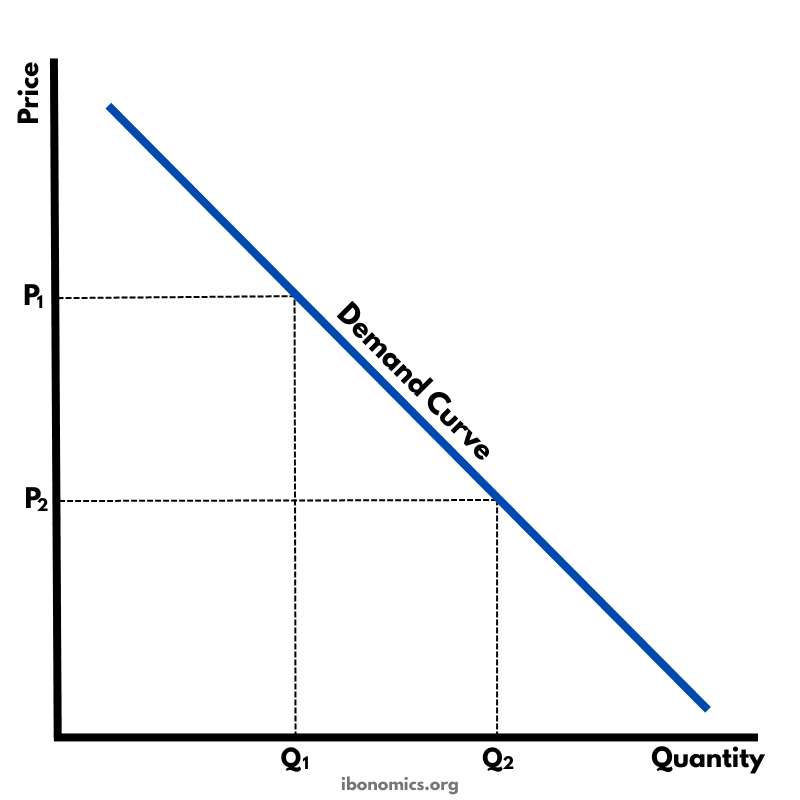
A basic diagram showing the inverse relationship between price and quantity demanded, illustrating the law of demand.
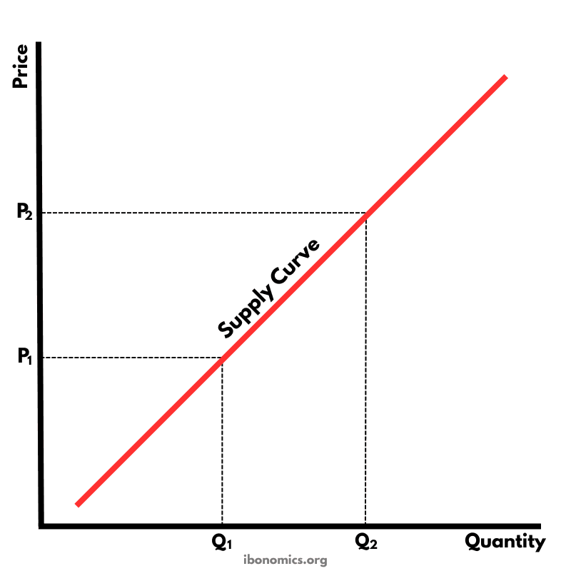
A basic diagram showing the positive relationship between price and quantity supplied, illustrating the law of supply.
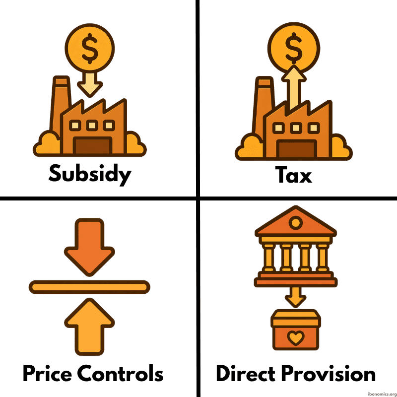
A simple diagram showing four common forms of government intervention in markets: subsidies, taxes, price controls, and direct provision.
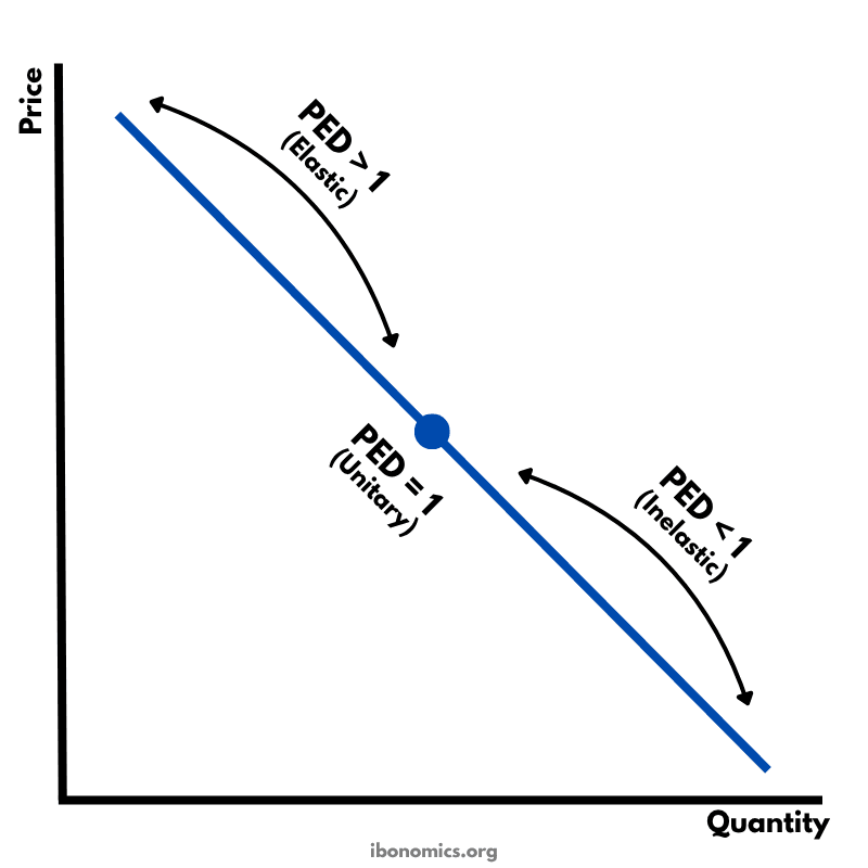
A diagram showing how price elasticity of demand changes along a straight-line demand curve, from elastic to unitary elastic to inelastic.
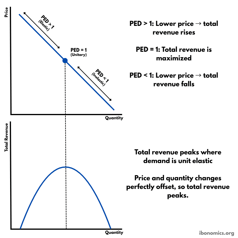
A diagram showing how price elasticity of demand affects total revenue, with total revenue maximized where demand is unitary elastic.