Monopoly – Abnormal Profit and Welfare Loss
Microeconomics
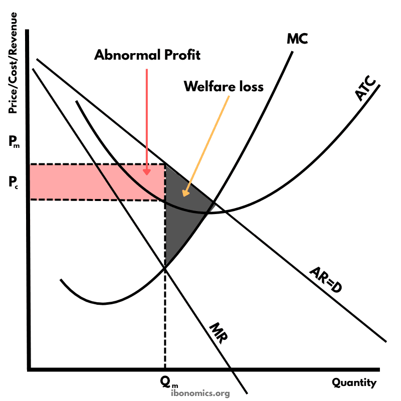
A diagram illustrating a monopolist earning abnormal profit. The firm restricts output to Qm where MC = MR and sets price Pm, resulting in welfare loss and consumer surplus loss compared to a perfectly competitive outcome.
Curves and Elements
ar
AR = D: The average revenue or demand curve, downward sloping due to price-setting power.
mr
MR: Marginal Revenue, lies below AR for monopolies.
mc
MC: Marginal Cost, intersects MR at the profit-maximizing quantity Qm.
atc
ATC: Average Total Cost, used to calculate the firm's level of profit.
q
Qm: The monopolist's profit-maximizing quantity where MC = MR.
p
Pm: The price charged by the monopolist at Qm, found on the AR curve.
pc
Pc: The allocatively efficient price that would exist in a perfectly competitive market, where MC intersects the AR (demand) curve.
A monopolist maximizes profit where marginal cost (MC) equals marginal revenue (MR), producing quantity Qm.
The price Pm is set by extending a vertical line from Qm up to the demand curve (AR = D).
Since Pm is greater than average total cost (ATC) at Qm, the firm earns abnormal profit (shown in pink).
The price Pc represents the price that would exist under perfect competition, where MC = AR. This is the allocatively efficient point.
The shaded welfare loss triangle represents the loss of societal welfare due to the monopolist underproducing relative to the socially optimal quantity.
Monopolies lead to market failure because they do not produce at the socially efficient output (MC ≠ AR).
More Microeconomics Diagrams
Explore other diagrams from the same unit to deepen your understanding
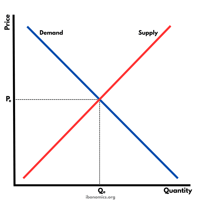
The fundamental diagram showing the relationship between demand and supply in a competitive market, determining equilibrium price and quantity.
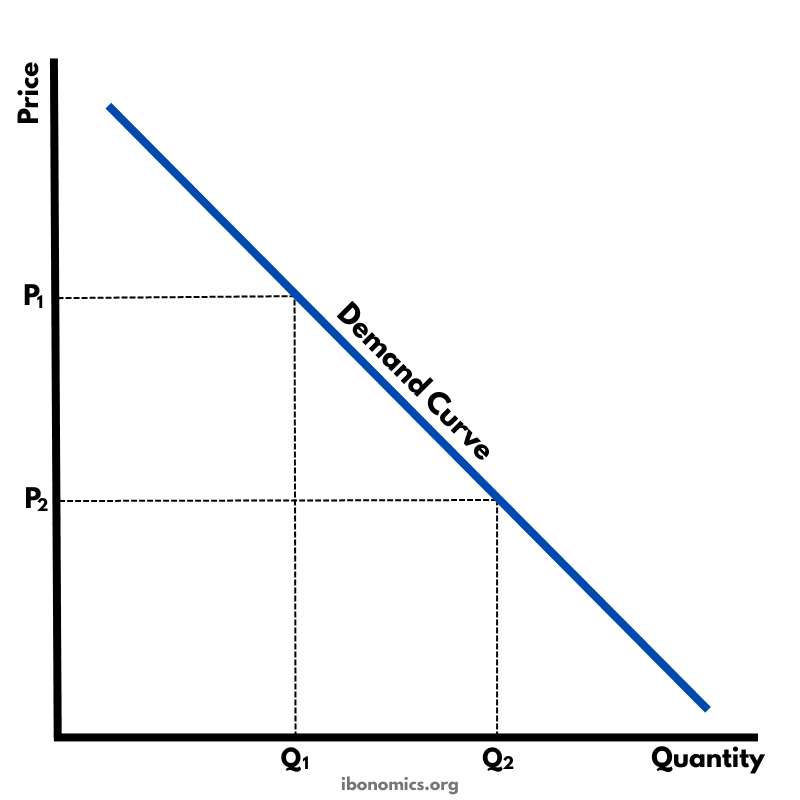
A basic diagram showing the inverse relationship between price and quantity demanded, illustrating the law of demand.
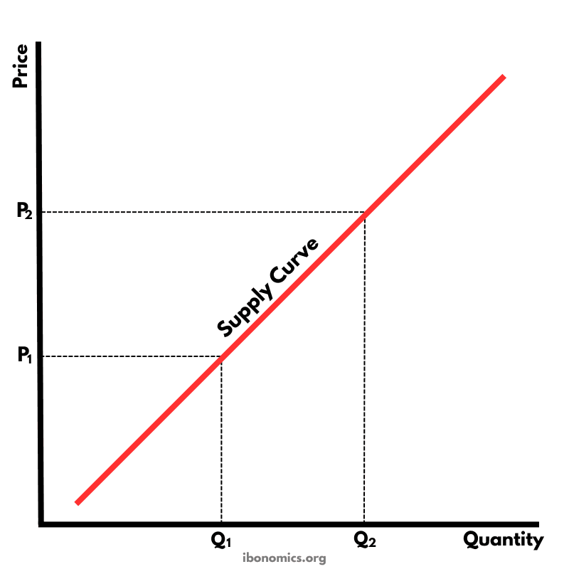
A basic diagram showing the positive relationship between price and quantity supplied, illustrating the law of supply.
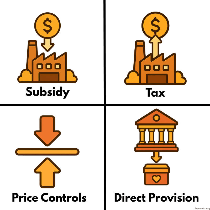
A simple diagram showing four common forms of government intervention in markets: subsidies, taxes, price controls, and direct provision.
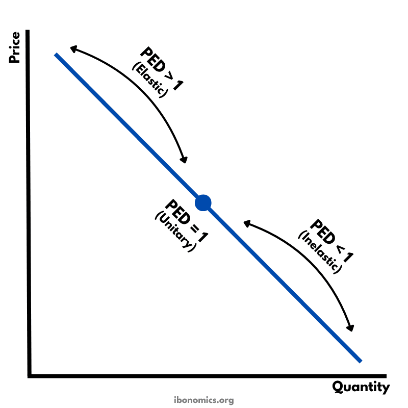
A diagram showing how price elasticity of demand changes along a straight-line demand curve, from elastic to unitary elastic to inelastic.
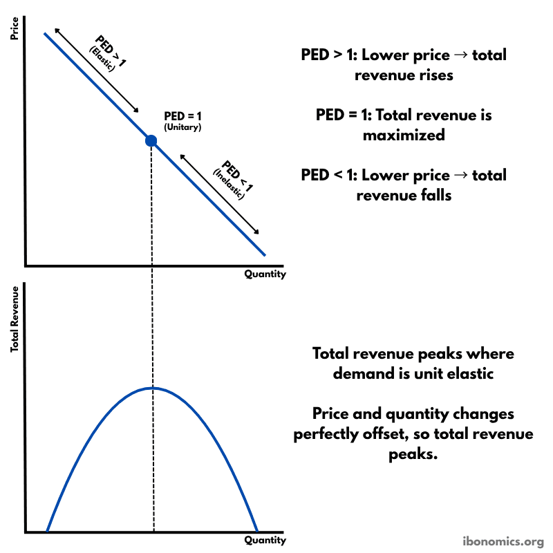
A diagram showing how price elasticity of demand affects total revenue, with total revenue maximized where demand is unitary elastic.