Income Elasticity of Demand (YED)
Microeconomics
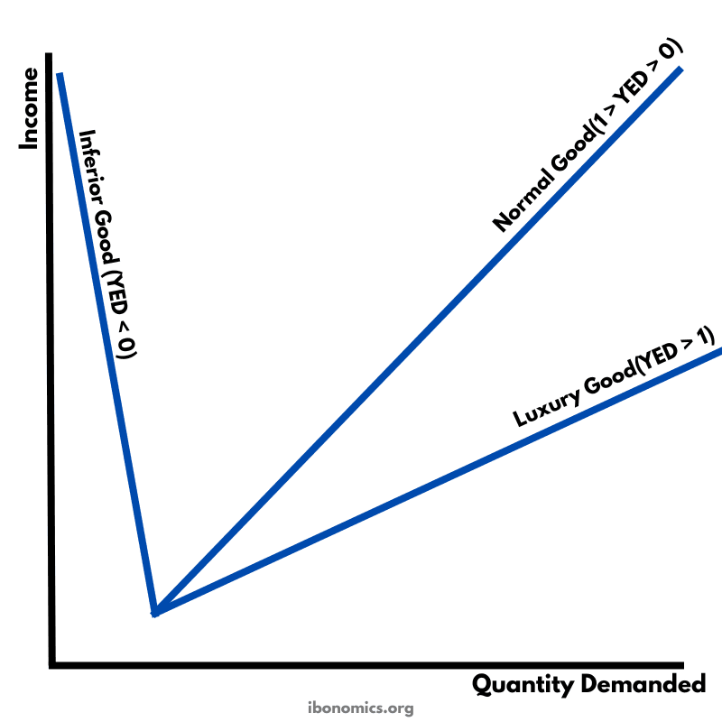
A diagram illustrating different values of income elasticity of demand (YED) and how quantity demanded responds to changes in income for inferior, normal, and luxury goods.
Curves and Elements
inferior good
Inferior Good (YED < 0): Demand falls as income rises.
normal good
Normal Good (0 < YED < 1): Demand rises with income but less than proportionally.
luxury good
Luxury Good (YED > 1): Demand rises more than proportionally as income increases.
income axis
Income Axis: Measures changes in consumer income.
quantity axis
Quantity Demanded Axis: Measures the quantity demanded of the good.
Income elasticity of demand (YED) measures the responsiveness of quantity demanded to a change in consumer income.
For an inferior good, YED is negative (YED < 0), meaning that as income rises, quantity demanded falls.
For a normal good, YED is positive but less than 1 (0 < YED < 1), so quantity demanded rises with income but at a proportionally smaller rate.
For a luxury good, YED is greater than 1 (YED > 1), meaning quantity demanded increases more than proportionally as income rises.
The steeper the slope of the income–quantity relationship, the more responsive demand is to changes in income.
More Microeconomics Diagrams
Explore other diagrams from the same unit to deepen your understanding
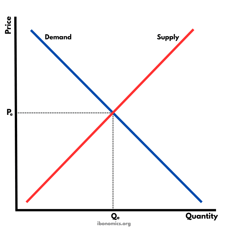
The fundamental diagram showing the relationship between demand and supply in a competitive market, determining equilibrium price and quantity.
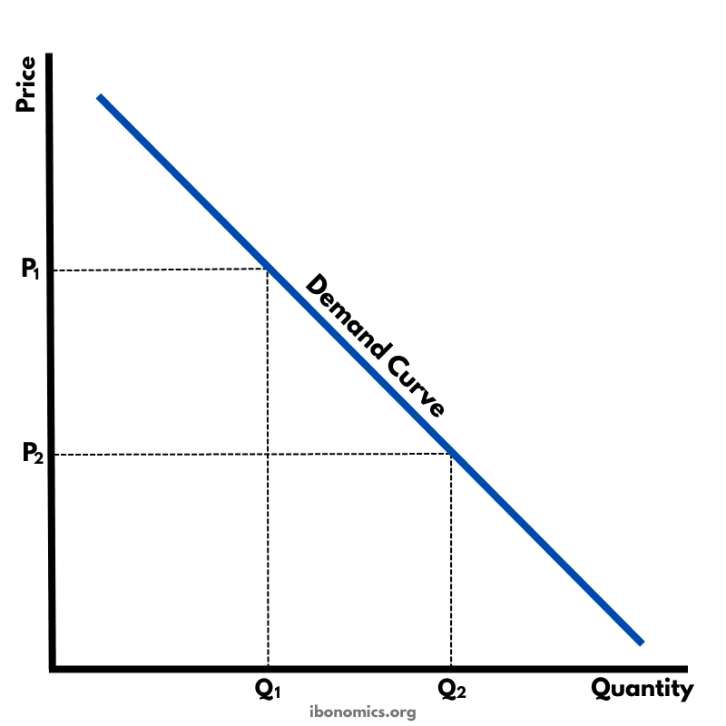
A basic diagram showing the inverse relationship between price and quantity demanded, illustrating the law of demand.
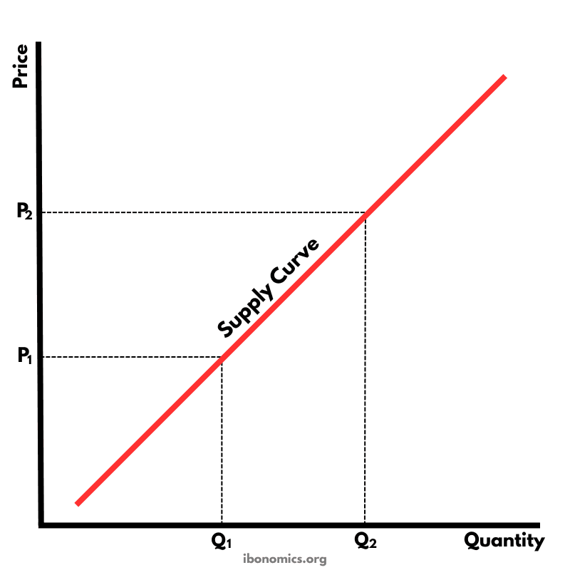
A basic diagram showing the positive relationship between price and quantity supplied, illustrating the law of supply.
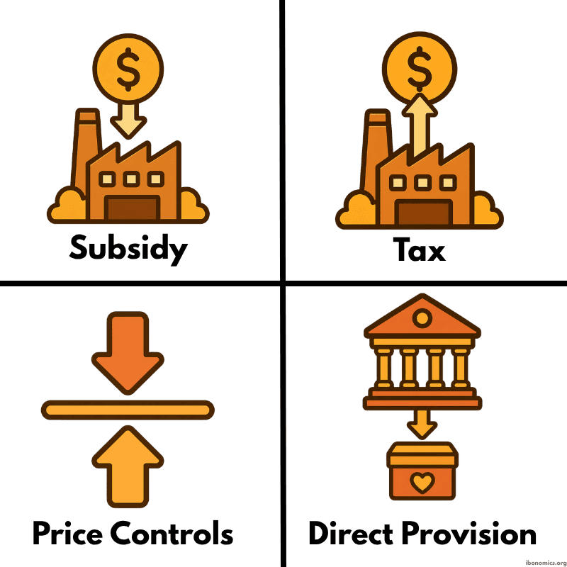
A simple diagram showing four common forms of government intervention in markets: subsidies, taxes, price controls, and direct provision.
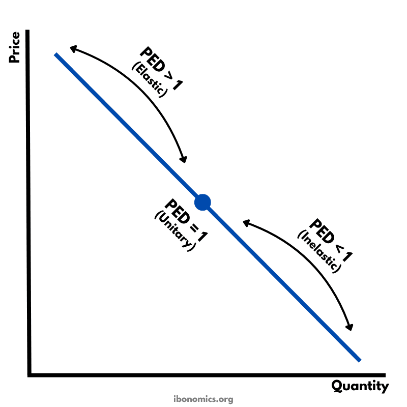
A diagram showing how price elasticity of demand changes along a straight-line demand curve, from elastic to unitary elastic to inelastic.
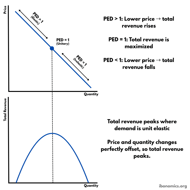
A diagram showing how price elasticity of demand affects total revenue, with total revenue maximized where demand is unitary elastic.