Subsidy and Market Outcomes
Microeconomics
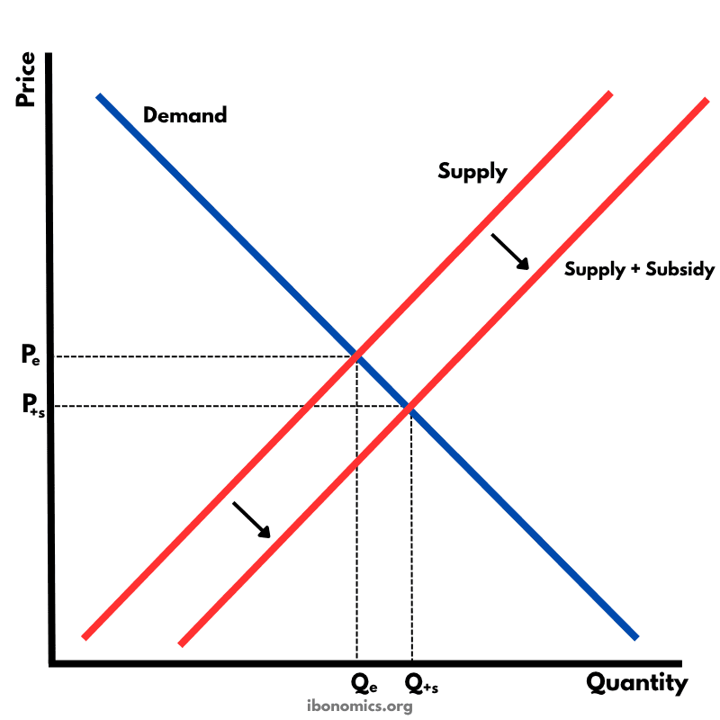
A diagram showing the effect of a government subsidy on a market, resulting in a downward shift of the supply curve, lower price for consumers, and increased quantity supplied.
Curves and Elements
demand
Demand Curve: Downward-sloping, representing the inverse relationship between price and quantity demanded.
original supply
Supply Curve: Upward-sloping, reflecting the direct relationship between price and quantity supplied before subsidy.
new supply
Supply + Subsidy: A downward shift of the supply curve due to a per-unit subsidy, reducing producers' costs.
price change
Price Effect: The market price falls from Pe to P+s, making the good more affordable for consumers.
quantity change
Quantity Effect: Output increases from Qe to Q+s due to the incentive created by the subsidy.
A subsidy is a payment made by the government to producers to reduce their costs of production and encourage increased output.
The subsidy causes the supply curve to shift downward (or to the right), from 'Supply' to 'Supply + Subsidy'.
At the new equilibrium, the price paid by consumers falls from Pe to P+s, and quantity increases from Qe to Q+s.
The vertical distance between the original and new supply curves represents the value of the subsidy per unit.
While subsidies can increase affordability and support industries (e.g., agriculture, green energy), they have opportunity costs and can lead to overproduction or inefficiencies if poorly targeted.
More Microeconomics Diagrams
Explore other diagrams from the same unit to deepen your understanding
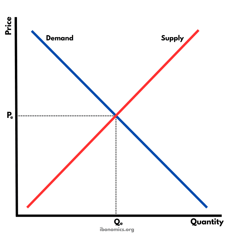
The fundamental diagram showing the relationship between demand and supply in a competitive market, determining equilibrium price and quantity.
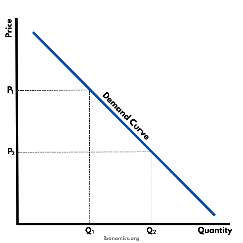
A basic diagram showing the inverse relationship between price and quantity demanded, illustrating the law of demand.
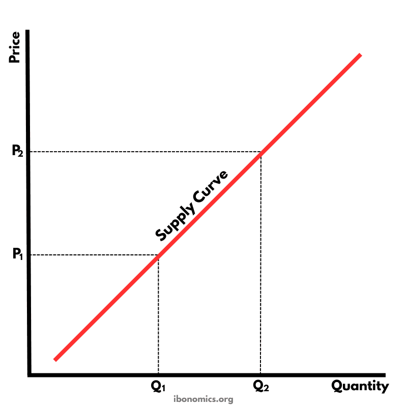
A basic diagram showing the positive relationship between price and quantity supplied, illustrating the law of supply.
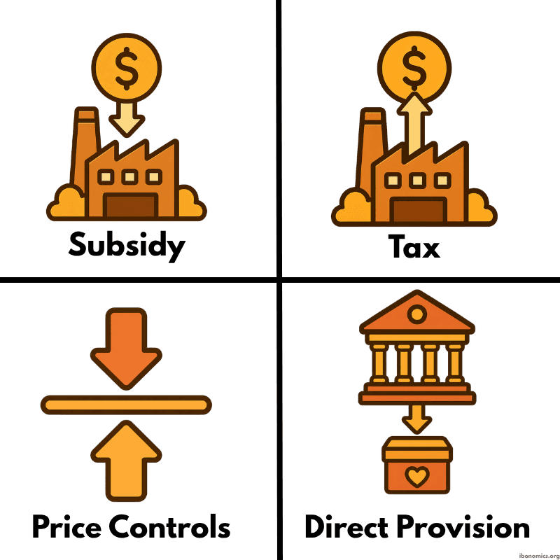
A simple diagram showing four common forms of government intervention in markets: subsidies, taxes, price controls, and direct provision.
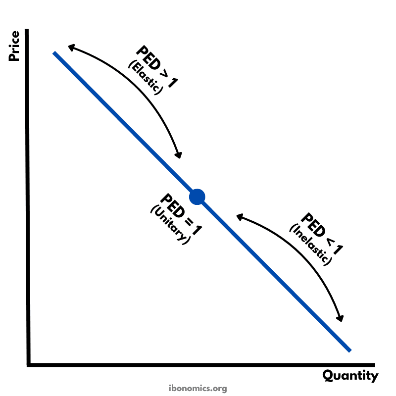
A diagram showing how price elasticity of demand changes along a straight-line demand curve, from elastic to unitary elastic to inelastic.
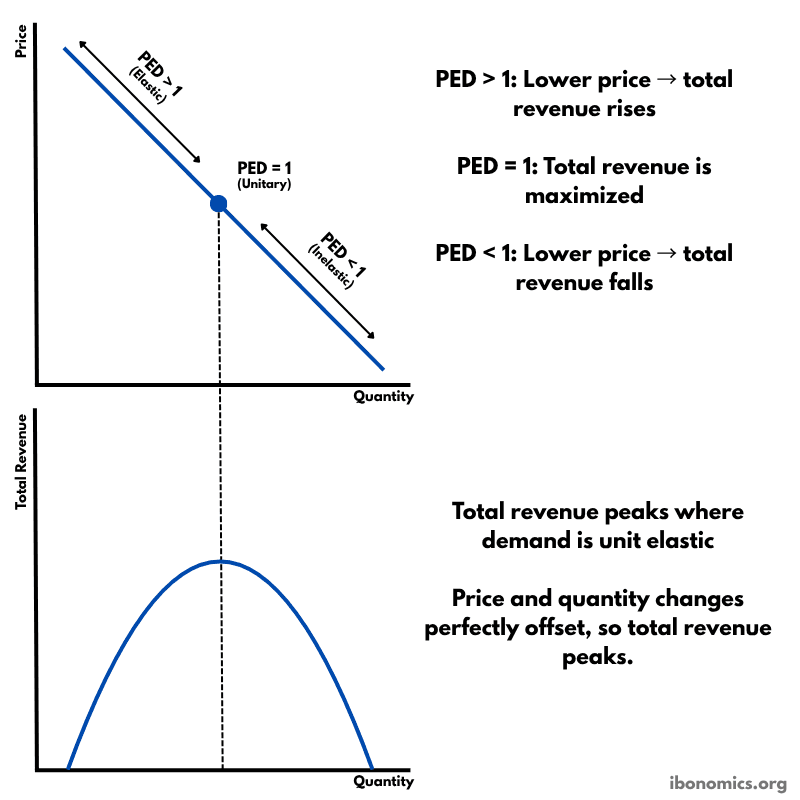
A diagram showing how price elasticity of demand affects total revenue, with total revenue maximized where demand is unitary elastic.