Types of Taxes – Progressive, Regressive, and Proportional
Macroeconomics
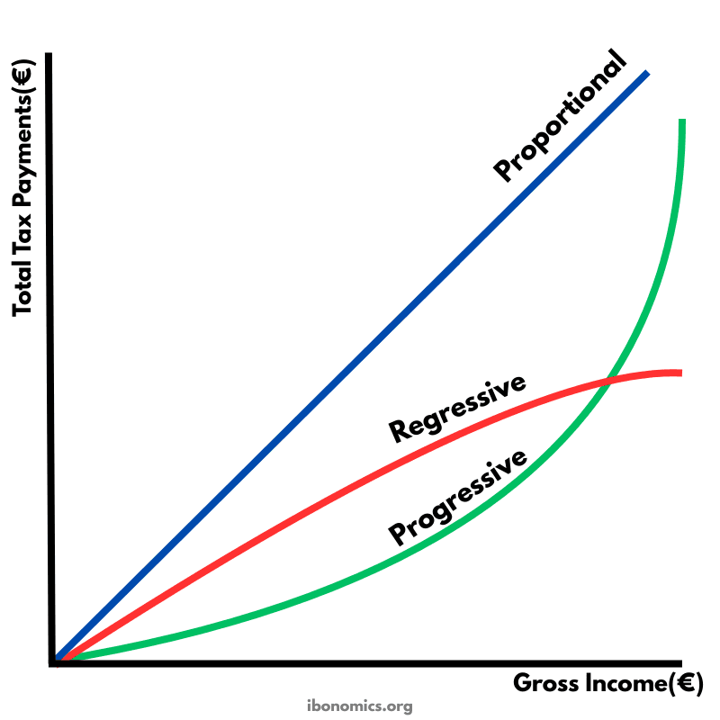
This diagram compares three tax systems by showing how total tax payments change as gross income rises. The shape of each line shows whether tax payments increase at a constant rate, faster than income, or slower than income. This helps illustrate how the tax burden is shared across low and high income earners in proportional, progressive, and regressive tax systems.
Curves and Elements
proportional
Proportional tax line: A straight line showing total tax rises at a constant rate as income increases.
progressive
Progressive tax line: A curve that becomes steeper, showing total tax rises faster at higher income levels because the average tax rate increases.
regressive
Regressive tax line: A curve that becomes flatter, showing total tax rises more slowly at higher income levels because the average tax rate falls.
Proportional tax means the tax rate is constant for all income levels. As income rises, total tax paid rises in a straight line, and everyone pays the same percentage of their income in tax.
Progressive tax means the average tax rate rises as income rises. Higher income earners pay a larger percentage of their income in tax, so total tax paid increases more than proportionally as income increases.
Regressive tax means the average tax rate falls as income rises. Lower income earners pay a larger percentage of their income in tax, so total tax paid increases less than proportionally as income increases.
The diagram focuses on total tax payments, but the key IB idea is how the average tax rate changes with income in each system.
Progressive taxes are commonly used to reduce income inequality, while regressive taxes can increase inequality if they take a larger share from low income households.
More Macroeconomics Diagrams
Explore other diagrams from the same unit to deepen your understanding

A diagram illustrating the fluctuations in real GDP over time, including periods of boom, recession, peak, and trough, relative to the long-term trend of economic growth.

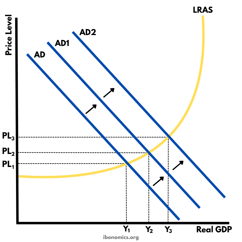
This diagram shows the intersection of the aggregate demand (AD) and short-run aggregate supply (AS) curves to determine the equilibrium price level and real GDP.

A diagram showing the Classical model of aggregate demand (AD), short-run aggregate supply (SRAS), and long-run aggregate supply (LRAS), used to explain long-run macroeconomic equilibrium.

A Keynesian aggregate demand and long-run aggregate supply (AD–LRAS) diagram showing how real GDP and the price level interact across different phases of the economy, including spare capacity and full employment.

A diagram showing an output (deflationary) gap, where the economy is producing below its full employment level of output (Ye).
This diagram shows how an initial increase in aggregate demand leads to a multiplied increase in national output (real GDP) and price level within the Keynesian framework.