Ad Valorem Tax – Percentage Tax on Supply
Microeconomics
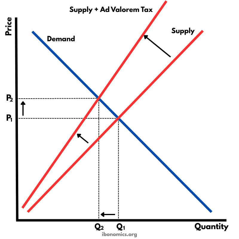
This diagram illustrates the effect of an ad valorem (percentage) tax on producers. Unlike a specific tax which shifts the supply curve upward in a parallel way, an ad valorem tax causes the supply curve to pivot and become steeper. As price rises, the tax amount increases proportionally, leading to a higher final price for consumers and a lower equilibrium quantity.
Curves and Elements
demand
Demand: Downward-sloping curve showing consumer willingness to buy at different prices.
original supply
Original Supply: Producer costs before the tax.
taxed supply
Supply + Ad Valorem Tax: Rotated, steeper supply curve representing percentage-based tax.
p1
P1: Original equilibrium price before the tax.
p2
P2: Higher price paid by consumers after the tax.
q1
Q1: Original equilibrium quantity before the tax.
q2
Q2: Reduced equilibrium quantity due to the tax.
The original supply curve is shown on the right. Producers set price P1 at the initial equilibrium.
An ad valorem tax raises production costs by a percentage at every price level, causing the supply curve to rotate upward and become steeper.
The new equilibrium price increases from P1 to P2, meaning consumers pay more after the tax is imposed.
The equilibrium quantity falls to Q1, showing reduced output and consumption due to higher prices.
Because the tax is percentage-based, the gap between the old and new supply curves widens as the price increases.
More Microeconomics Diagrams
Explore other diagrams from the same unit to deepen your understanding
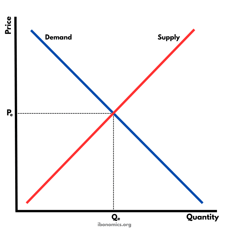
The fundamental diagram showing the relationship between demand and supply in a competitive market, determining equilibrium price and quantity.
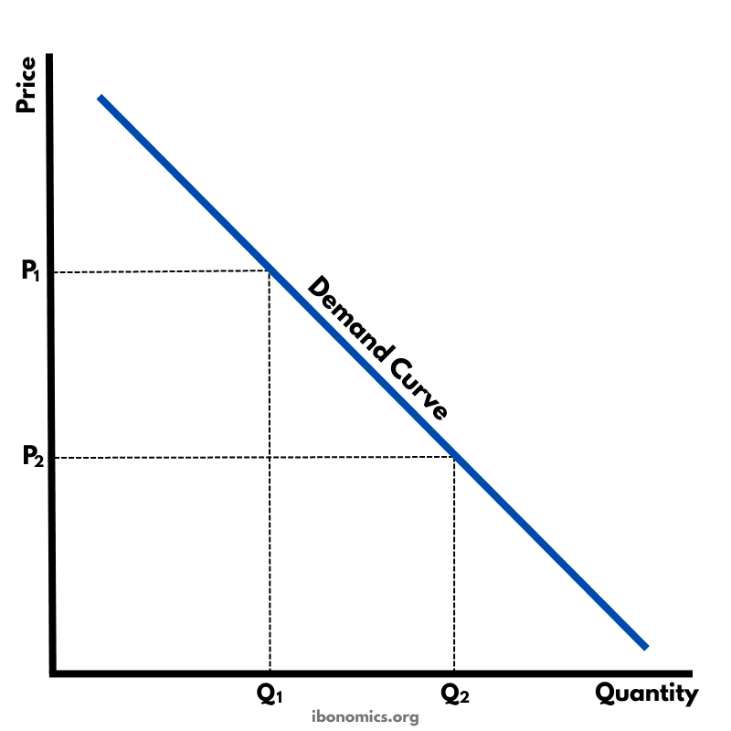
A basic diagram showing the inverse relationship between price and quantity demanded, illustrating the law of demand.
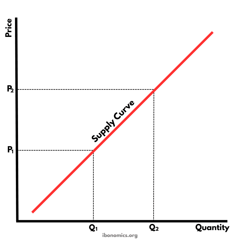
A basic diagram showing the positive relationship between price and quantity supplied, illustrating the law of supply.
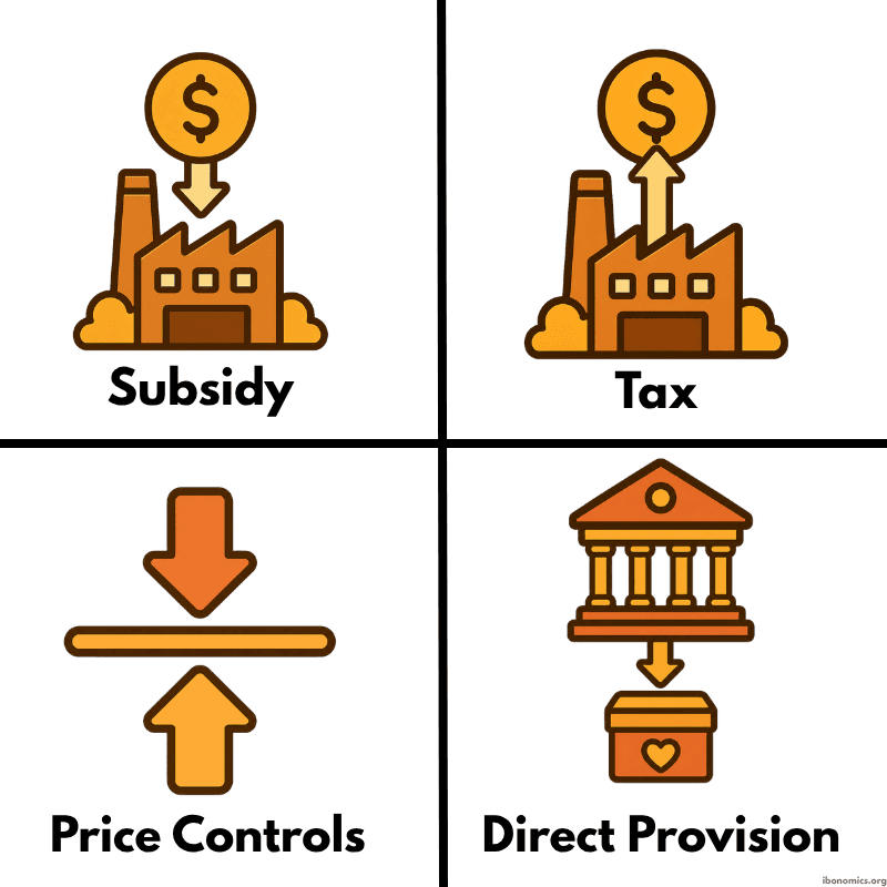
A simple diagram showing four common forms of government intervention in markets: subsidies, taxes, price controls, and direct provision.
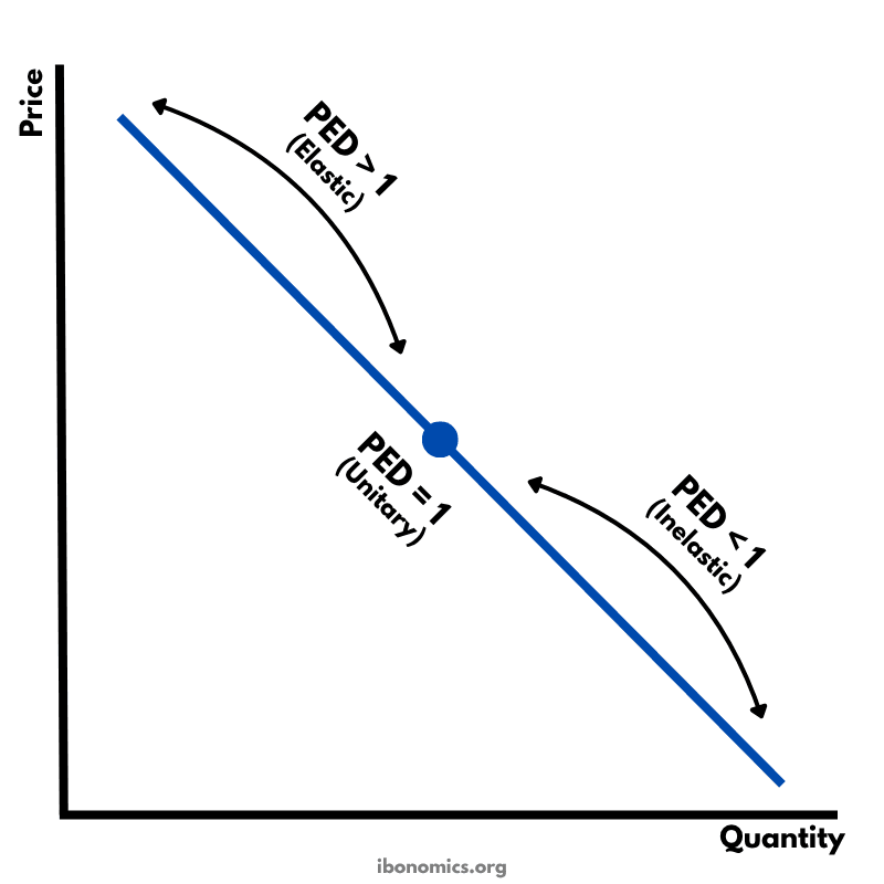
A diagram showing how price elasticity of demand changes along a straight-line demand curve, from elastic to unitary elastic to inelastic.
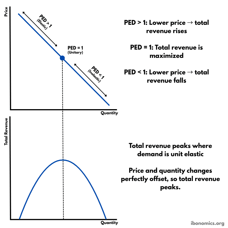
A diagram showing how price elasticity of demand affects total revenue, with total revenue maximized where demand is unitary elastic.