Structural Unemployment – Labour Market Impact
Macroeconomics
This diagram illustrates structural unemployment in the labour market, shown by a leftward shift in the labour demand curve (ADL).
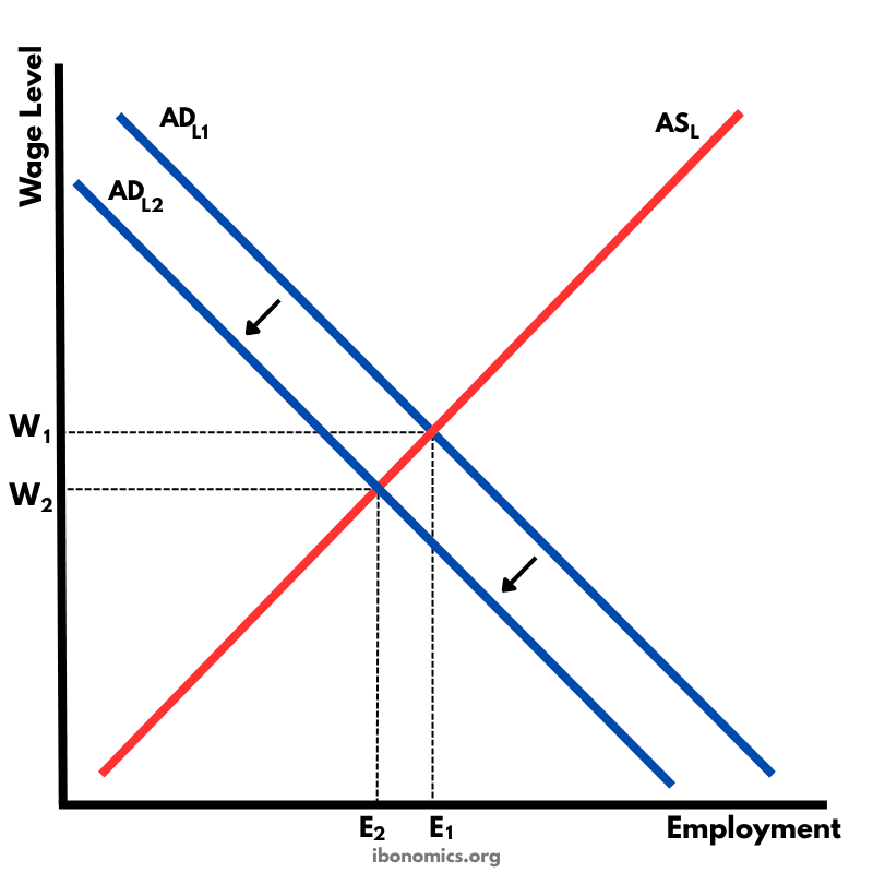
Curves and Elements
adl1
ADL1: Initial demand for labour before structural change.
adl2
ADL2: New, lower demand for labour after structural change.
asl
ASL: Aggregate supply of labour, assumed unchanged in the short run.
w1
W1: Initial equilibrium wage before the shift in demand.
w2
W2: New, lower equilibrium wage after demand falls.
e1
E1: Original employment level before the structural shift.
e2
E2: New, lower employment level after the shift.
unemployment
Unemployment caused by the fall in demand, represented by the gap between E1 and E2.
Structural unemployment occurs when there is a mismatch between the skills workers have and the skills demanded by employers. It is often caused by technological change, automation, offshoring, or long-term industry decline.
Initially, the labour market equilibrium is at wage W1 and employment E1, where ADL1 intersects ASL.
A shift from ADL1 to ADL2 reflects a fall in demand for certain types of labour due to structural changes.
The new equilibrium is at wage W2 and lower employment E2.
The difference between E1 and E2 represents workers who are unemployed due to their skills no longer being in demand.
More Macroeconomics Diagrams
Explore other diagrams from the same unit to deepen your understanding

A diagram illustrating the fluctuations in real GDP over time, including periods of boom, recession, peak, and trough, relative to the long-term trend of economic growth.

This diagram shows the intersection of the aggregate demand (AD) and short-run aggregate supply (AS) curves to determine the equilibrium price level and real GDP.

A diagram showing the Classical model of aggregate demand (AD), short-run aggregate supply (SRAS), and long-run aggregate supply (LRAS), used to explain long-run macroeconomic equilibrium.

A Keynesian aggregate demand and long-run aggregate supply (AD–LRAS) diagram showing how real GDP and the price level interact across different phases of the economy, including spare capacity and full employment.

A diagram showing an output (deflationary) gap, where the economy is producing below its full employment level of output (Ye).
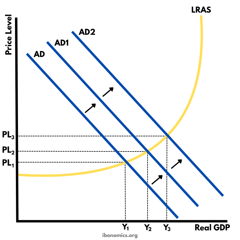
This diagram shows how an initial increase in aggregate demand leads to a multiplied increase in national output (real GDP) and price level within the Keynesian framework.