Phillips Curve – Short-Run vs Long-Run Trade-off
Macroeconomics
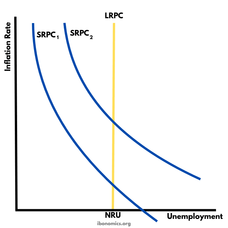
This diagram illustrates the short-run and long-run Phillips Curve, showing the relationship between inflation and unemployment.
Curves and Elements
SRPC1
SRPC1: Initial short-run Phillips Curve showing inverse inflation-unemployment trade-off.
SRPC2
SRPC2: New short-run Phillips Curve after expectations adjust (e.g., following disinflation policies).
LRPC
LRPC: Long-run Phillips Curve which is vertical at the natural rate of unemployment (NRU).
nRU
NRU: Natural Rate of Unemployment aka the unemployment level where inflation is stable.
The short-run Phillips Curve (SRPC) shows an inverse relationship between inflation and unemployment — lower unemployment can be achieved at the cost of higher inflation, and vice versa.
SRPC1 represents the initial trade-off, while SRPC2 shows the effect of lower inflation expectations due to successful disinflation policies.
The Long-Run Phillips Curve (LRPC) is vertical at the natural rate of unemployment (NRU), indicating that in the long run, there's no trade-off between inflation and unemployment.
Attempts to maintain unemployment below the NRU will lead only to accelerating inflation without reducing unemployment in the long term.
This framework supports monetarist views that inflation is primarily a monetary phenomenon and long-term policy should aim to reduce inflation expectations.
More Macroeconomics Diagrams
Explore other diagrams from the same unit to deepen your understanding

A diagram illustrating the fluctuations in real GDP over time, including periods of boom, recession, peak, and trough, relative to the long-term trend of economic growth.

This diagram shows the intersection of the aggregate demand (AD) and short-run aggregate supply (AS) curves to determine the equilibrium price level and real GDP.

A diagram showing the Classical model of aggregate demand (AD), short-run aggregate supply (SRAS), and long-run aggregate supply (LRAS), used to explain long-run macroeconomic equilibrium.

A Keynesian aggregate demand and long-run aggregate supply (AD–LRAS) diagram showing how real GDP and the price level interact across different phases of the economy, including spare capacity and full employment.

A diagram showing an output (deflationary) gap, where the economy is producing below its full employment level of output (Ye).
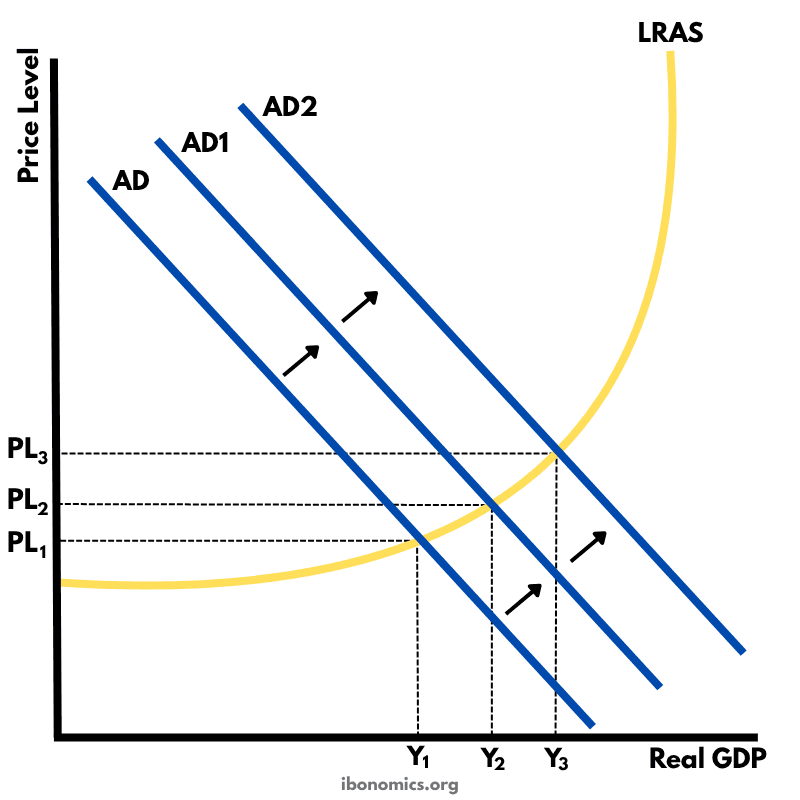
This diagram shows how an initial increase in aggregate demand leads to a multiplied increase in national output (real GDP) and price level within the Keynesian framework.