Long Run Economic Growth – Keynesian AS Model
Macroeconomics
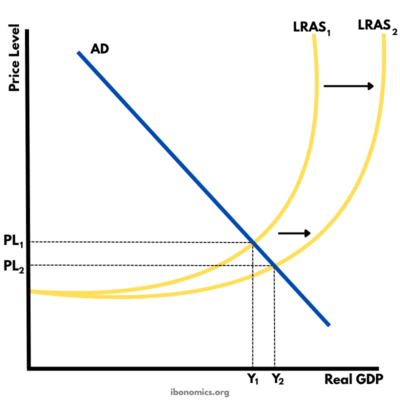
This diagram shows long-run economic growth using the Keynesian AS model, where potential output expands as LRAS shifts rightward.
Curves and Elements
ad
AD: Aggregate demand, assumed constant in this diagram.
lras1
LRAS1: Original long-run aggregate supply at potential output Y1.
lras2
LRAS2: New LRAS showing increased capacity at output Y2.
pl1
PL1: Initial price level before supply-side improvements.
pl2
PL2: Lower price level after LRAS shifts outward.
y1
Y1: Original level of real GDP.
y2
Y2: Higher level of real GDP following growth in potential output.
In the Keynesian AS model, the aggregate supply curve is upward sloping and becomes vertical at full employment output.
The initial equilibrium is at Y1 and PL1, where AD intersects LRAS1.
An outward shift from LRAS1 to LRAS2 represents an increase in the economy's productive capacity due to improvements in factors of production such as human capital, infrastructure, or technology.
This shift increases real output from Y1 to Y2 and reduces inflationary pressure, shown by a fall in the price level from PL1 to PL2.
This model is useful for showing how supply-side policies can lead to sustainable, non-inflationary economic growth over time.
More Macroeconomics Diagrams
Explore other diagrams from the same unit to deepen your understanding

A diagram illustrating the fluctuations in real GDP over time, including periods of boom, recession, peak, and trough, relative to the long-term trend of economic growth.

This diagram shows the intersection of the aggregate demand (AD) and short-run aggregate supply (AS) curves to determine the equilibrium price level and real GDP.

A diagram showing the Classical model of aggregate demand (AD), short-run aggregate supply (SRAS), and long-run aggregate supply (LRAS), used to explain long-run macroeconomic equilibrium.

A Keynesian aggregate demand and long-run aggregate supply (AD–LRAS) diagram showing how real GDP and the price level interact across different phases of the economy, including spare capacity and full employment.

A diagram showing an output (deflationary) gap, where the economy is producing below its full employment level of output (Ye).
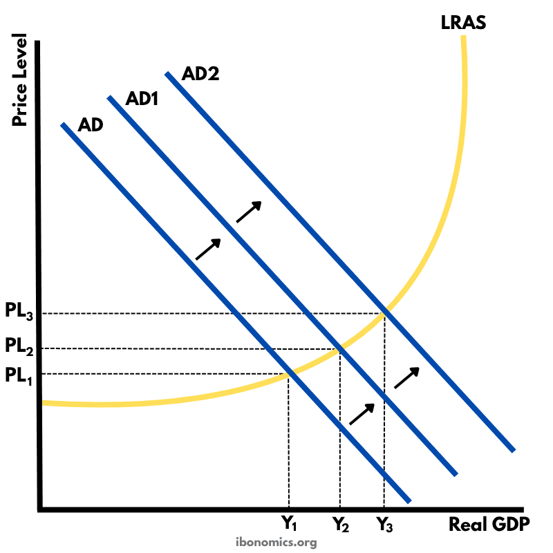
This diagram shows how an initial increase in aggregate demand leads to a multiplied increase in national output (real GDP) and price level within the Keynesian framework.