Inflation, Disinflation, Deflation, and Reinflation – The Price-Level Cycle
Macroeconomics
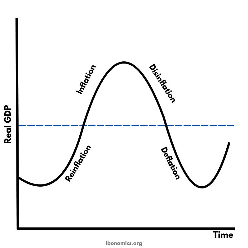
This diagram illustrates the movement of the price level over time, showing how an economy can shift between inflation, disinflation, deflation, and reinflation. Each phase represents a different rate of change in the general price level. The diagram helps students visualise how price pressures rise and fall throughout the business cycle.
Curves and Elements
inflation
Inflation: The rising section of the curve where price levels increase at a faster rate.
disinflation
Disinflation: The slowing of inflation shown by the flattening of the curve after the peak.
deflation
Deflation: The downward section where prices fall below the long-run trend line.
reinflation
Reinflation: The recovery from deflation when prices start rising again.
Inflation occurs when the general price level is rising at a sustained rate. In the diagram, this is the upward section where prices increase more quickly over time.
Disinflation is a fall in the rate of inflation. Prices are still rising, but at a slower pace. This appears on the diagram as the curve flattening after the peak.
Deflation is a decrease in the general price level. Prices are falling, shown by the downward section of the curve below the trend line.
Reinflation occurs when the economy recovers from deflation and the price level begins increasing again. This is shown when the curve turns upward after reaching its lowest point.
More Macroeconomics Diagrams
Explore other diagrams from the same unit to deepen your understanding

A diagram illustrating the fluctuations in real GDP over time, including periods of boom, recession, peak, and trough, relative to the long-term trend of economic growth.

This diagram shows the intersection of the aggregate demand (AD) and short-run aggregate supply (AS) curves to determine the equilibrium price level and real GDP.

A diagram showing the Classical model of aggregate demand (AD), short-run aggregate supply (SRAS), and long-run aggregate supply (LRAS), used to explain long-run macroeconomic equilibrium.

A Keynesian aggregate demand and long-run aggregate supply (AD–LRAS) diagram showing how real GDP and the price level interact across different phases of the economy, including spare capacity and full employment.

A diagram showing an output (deflationary) gap, where the economy is producing below its full employment level of output (Ye).
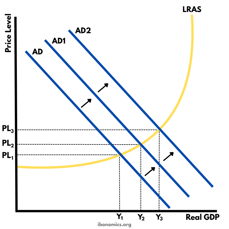
This diagram shows how an initial increase in aggregate demand leads to a multiplied increase in national output (real GDP) and price level within the Keynesian framework.