Quota Diagram – Protectionism
Global Economics
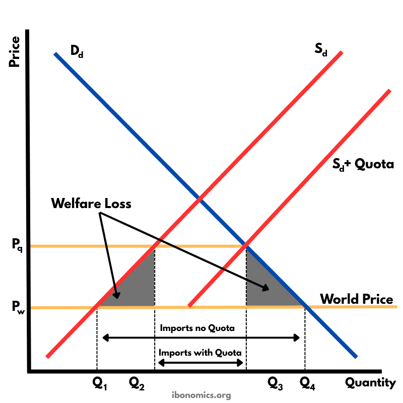
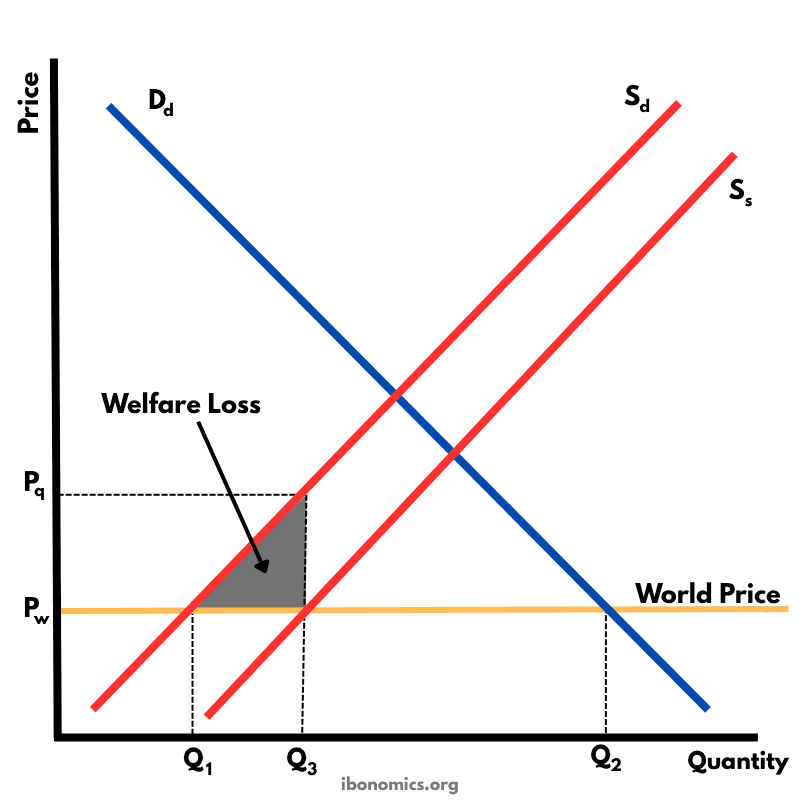
This diagram shows the impact of an import quota that limits how many units of a good can be imported. By restricting imports, the domestic price rises above the world price, domestic producers expand output, consumers buy less, and there is a net welfare loss.
Curves and Elements
dd
Dd: Domestic demand curve for the good.
sd
Sd: Original domestic supply curve.
sd quota
Sd + Quota: Effective supply curve once quota-limited imports are added to domestic supply.
pw
Pworld: World price under free trade (perfectly elastic world supply).
pq
Pquota: Higher domestic price after the quota restricts imports.
q1
Q1: Domestic quantity supplied at Pworld.
q2
Q2: Domestic quantity supplied at Pquota.
q3
Q3: Domestic quantity demanded (and total quantity traded) at Pquota.
q4
Q4: Domestic quantity demanded at Pworld.
imports no quota
Imports before quota: Q4 − Q1.
imports with quota
Imports with quota: Q2 − Q1 (determined by the size of the quota).
welfare loss
Welfare Loss: Two shaded triangles showing deadweight loss from overproduction and underconsumption.
With free trade, the world price (Pworld) sets the domestic price: quantity demanded is Q4 and domestic supply is Q1, so imports are Q4 − Q1.
The quota limits the maximum volume of imports, creating scarcity and pushing the domestic price up from Pworld to Pquota.
At the higher price (Pquota), domestic producers increase output from Q1 to Q2 (they move up along Sd).
Consumers reduce quantity demanded from Q4 to Q3 (they move up along Dd) due to the higher price.
With the quota, total quantity traded is Q3, and imports are now Q3 − Q2, which is smaller than before (a fall in imports).
The welfare loss (deadweight loss) is shown by the two shaded triangles: one from higher-cost domestic production (overproduction) and one from reduced consumption (underconsumption).
Unlike a tariff, a quota does not automatically create government revenue; any ‘quota rents’ depend on how import licences are allocated.
More Global Economics Diagrams
Explore other diagrams from the same unit to deepen your understanding
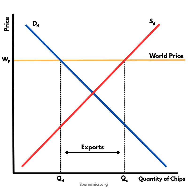
This diagram shows how a country exports goods under free trade when the world price is higher than the domestic equilibrium price.
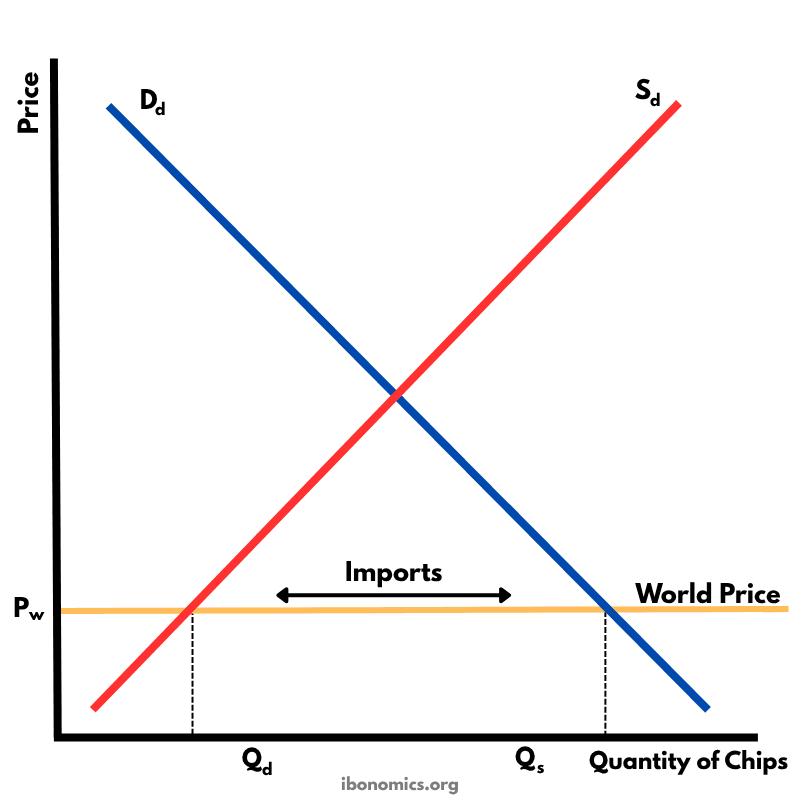
This diagram illustrates how a country imports goods under free trade when the world price is lower than the domestic equilibrium price.
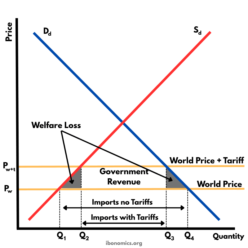
This diagram shows the effects of a tariff imposed on imported goods. A tariff raises the price of imports, protecting domestic producers but creating welfare losses.
This diagram illustrates the effects of a production subsidy, where the government supports domestic producers to lower their costs and increase output. It is a form of protectionism without raising consumer prices directly.
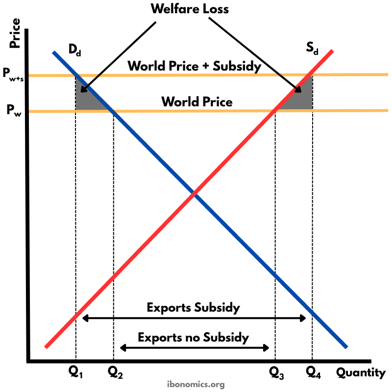
This diagram shows how an export subsidy raises the domestic price above the world price, encouraging producers to export more while reducing consumer welfare and creating deadweight losses.
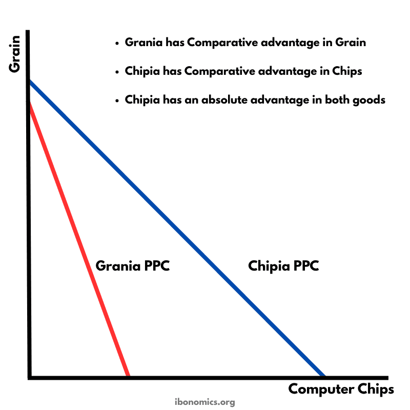
This diagram uses production possibility curves (PPCs) for two countries—Grania and Chipia—to illustrate absolute and comparative advantage and the potential gains from trade.