Comparative Advantage – Two-Country PPC
Global Economics
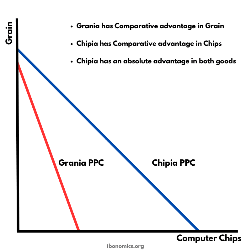
This diagram uses production possibility curves (PPCs) for two countries—Grania and Chipia—to illustrate absolute and comparative advantage and the potential gains from trade.
Curves and Elements
grania ppc
Grania PPC (red): Shows Grania’s production possibilities; steeper, indicating comparative advantage in grain.
chipia ppc
Chipia PPC (blue): Shows Chipia’s production possibilities; flatter, indicating comparative advantage in computer chips.
grain axis
Vertical axis measures grain output.
chips axis
Horizontal axis measures computer chip output.
comparative advantage notes
Bulleted notes identify each country’s comparative and absolute advantages.
Chipia’s PPC lies outside Grania’s PPC, indicating that Chipia has an absolute advantage in producing both grain and computer chips (it can produce more of each good with the same resources).
The steeper slope of Grania’s PPC means it has a lower opportunity cost in grain production, giving Grania a comparative advantage in grain.
The flatter slope of Chipia’s PPC indicates a lower opportunity cost in chip production, giving Chipia a comparative advantage in computer chips.
By specializing according to comparative advantage—Grania in grain and Chipia in chips—and trading, both countries can consume beyond their individual PPCs.
This model underpins the principle that even if a country is less efficient at producing all goods (no absolute advantage), it can still gain from trade by specializing in goods where it has a lower opportunity cost.
More Global Economics Diagrams
Explore other diagrams from the same unit to deepen your understanding
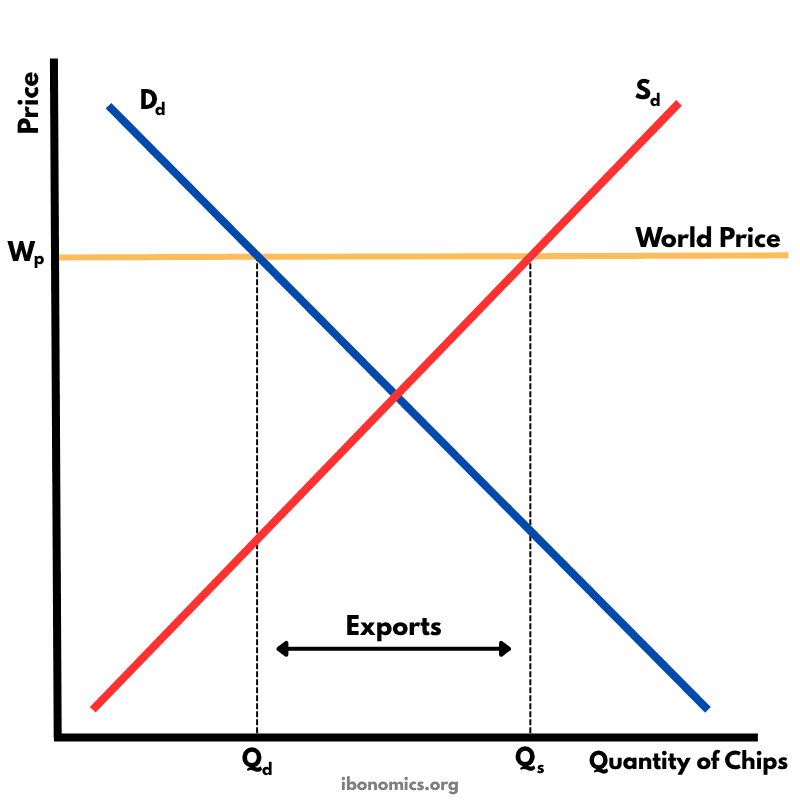
This diagram shows how a country exports goods under free trade when the world price is higher than the domestic equilibrium price.
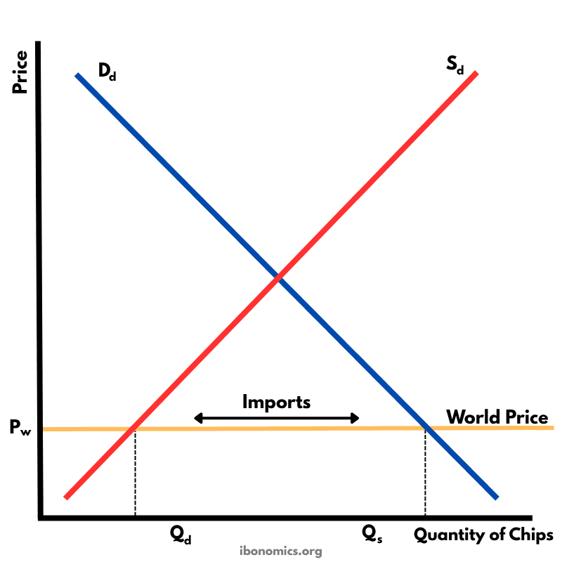
This diagram illustrates how a country imports goods under free trade when the world price is lower than the domestic equilibrium price.
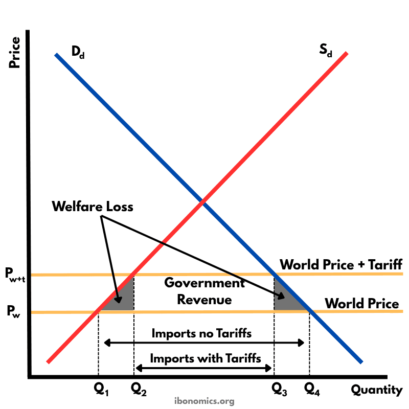
This diagram shows the effects of a tariff imposed on imported goods. A tariff raises the price of imports, protecting domestic producers but creating welfare losses.
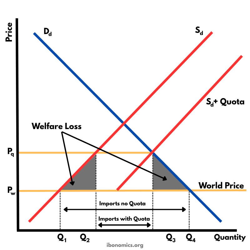
This diagram shows the impact of an import quota that limits how many units of a good can be imported. By restricting imports, the domestic price rises above the world price, domestic producers expand output, consumers buy less, and there is a net welfare loss.
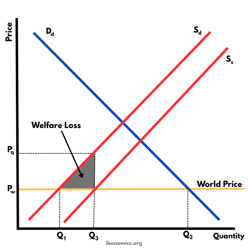
This diagram illustrates the effects of a production subsidy, where the government supports domestic producers to lower their costs and increase output. It is a form of protectionism without raising consumer prices directly.
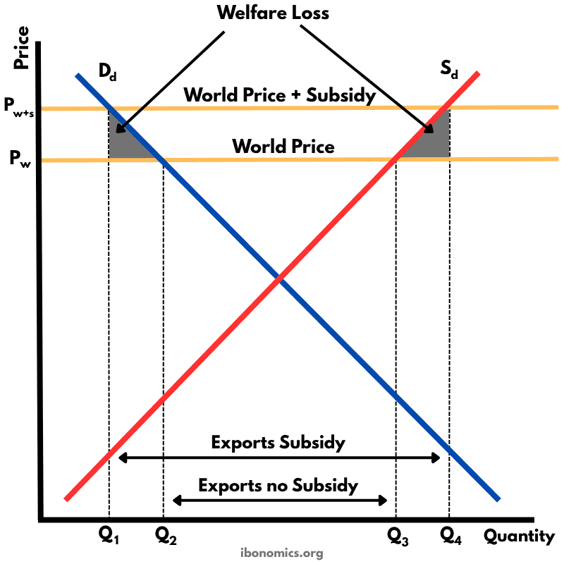
This diagram shows how an export subsidy raises the domestic price above the world price, encouraging producers to export more while reducing consumer welfare and creating deadweight losses.