Poverty Cycle – Low-Income Trap
Global Economics
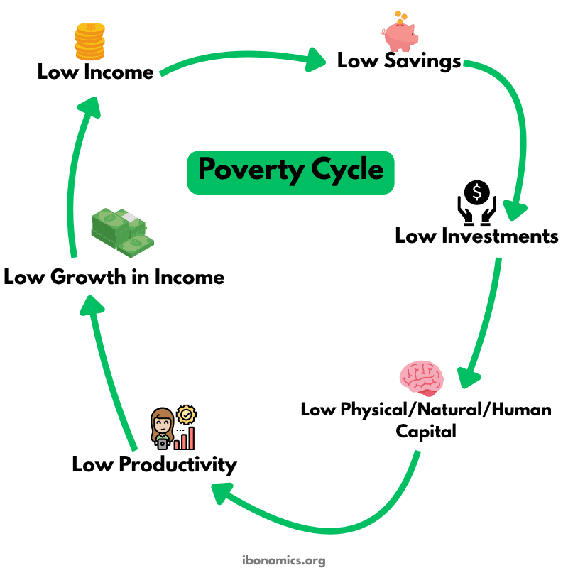
This diagram illustrates the poverty (development) cycle: a self-perpetuating loop where low income leads to low savings, low investment, low capital accumulation, low productivity, and therefore low growth in income, keeping households or countries trapped in poverty.
Curves and Elements
low income
Low Income: Starting point of the cycle, limiting households’ capacity to save.
low savings
Low Savings: Insufficient funds available for investment.
low investment
Low Investment: Few resources devotedtto capital formation.
low capital
Low Physical/Natural/Human Capital: Constrains productive capacity.
low productivity
Low Productivity: Output per worker remains low.
low growth income
Low Growth in Income: Incomes barely rise, feeding back into low income.
Low Income reduces households’ ability to save.
Low Savings limit funds available for productive investment.
Low Investment results in low physical, human, and natural capital formation.
Low Capital leads to Low Productivity of labour and resources.
Low Productivity constrains Growth in Income, feeding back into Low Income and continuing the cycle.
More Global Economics Diagrams
Explore other diagrams from the same unit to deepen your understanding
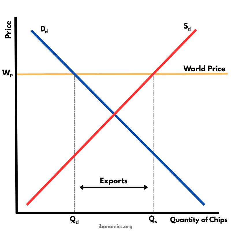
This diagram shows how a country exports goods under free trade when the world price is higher than the domestic equilibrium price.
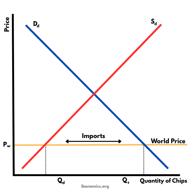
This diagram illustrates how a country imports goods under free trade when the world price is lower than the domestic equilibrium price.
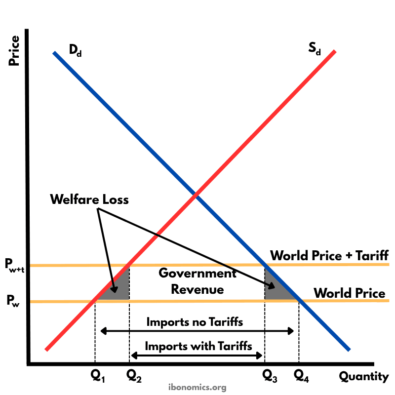
This diagram shows the effects of a tariff imposed on imported goods. A tariff raises the price of imports, protecting domestic producers but creating welfare losses.
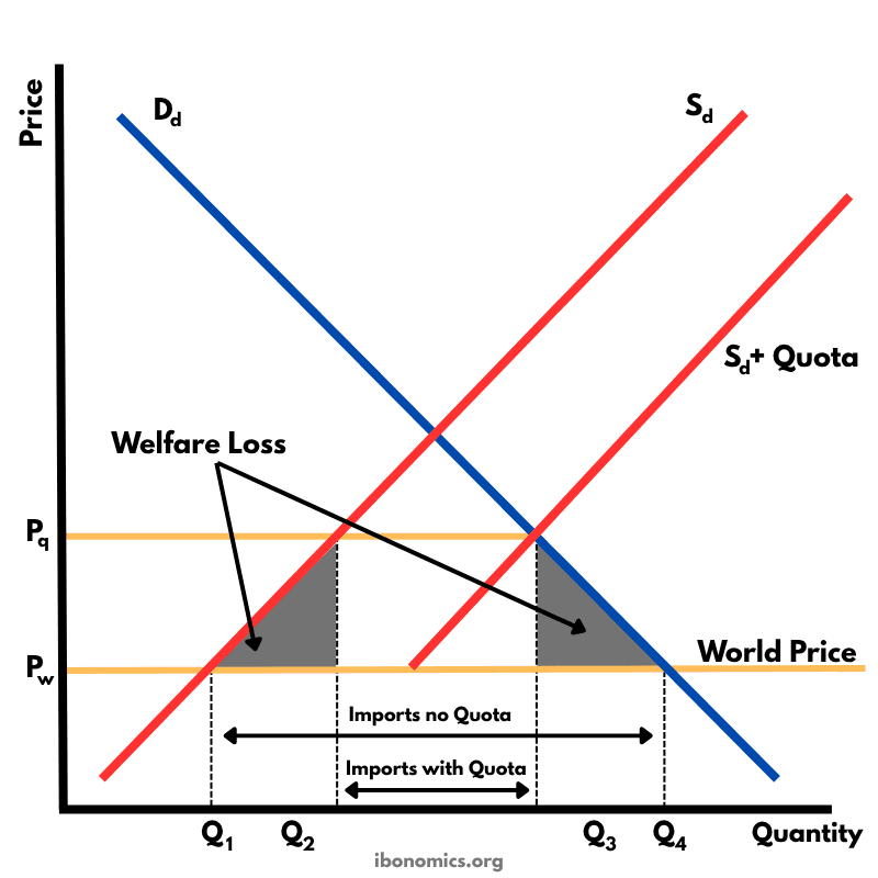
This diagram shows the impact of an import quota that limits how many units of a good can be imported. By restricting imports, the domestic price rises above the world price, domestic producers expand output, consumers buy less, and there is a net welfare loss.
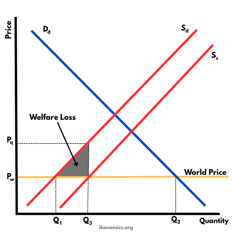
This diagram illustrates the effects of a production subsidy, where the government supports domestic producers to lower their costs and increase output. It is a form of protectionism without raising consumer prices directly.
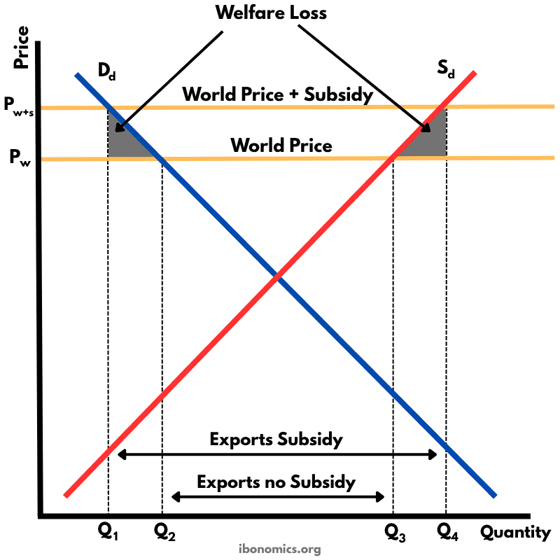
This diagram shows how an export subsidy raises the domestic price above the world price, encouraging producers to export more while reducing consumer welfare and creating deadweight losses.