Marshall–Lerner Condition and the J-Curve
Global Economics
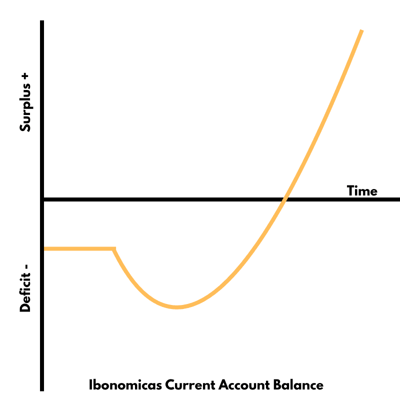
This diagram illustrates the J-curve effect that may follow a currency depreciation: a country’s current-account balance often worsens before it improves, in line with the Marshall–Lerner condition.
Curves and Elements
j curve
Orange J-shaped line showing the current-account balance path after depreciation.
x axis
Time after depreciation.
y axis
Current-account balance: surplus above, deficit below the baseline.
baseline
Horizontal line representing a zero balance (neither surplus nor deficit).
The Marshall–Lerner condition states that a depreciation (or devaluation) will improve the current-account balance only if the sum of the absolute values of the price elasticities of demand for exports and imports is greater than one.
In the short run, demand elasticities are low: contracts are fixed and consumers take time to adjust, so the trade balance may initially deteriorate (movement downward on the J-curve).
As time passes, quantity adjustments dominate: exports become cheaper for foreigners and imports become dearer for residents; if the Marshall–Lerner condition is satisfied, the current-account balance eventually improves, giving the upward part of the J-curve.
Failure to satisfy the elasticity condition means the trade balance could remain in deficit even after depreciation, highlighting the importance of elastic demand for successful expenditure-switching policies.
The diagram tracks Ibonomica’s current-account balance over time after its currency depreciates, showing the initial worsening and later surplus once elasticities take effect.
More Global Economics Diagrams
Explore other diagrams from the same unit to deepen your understanding
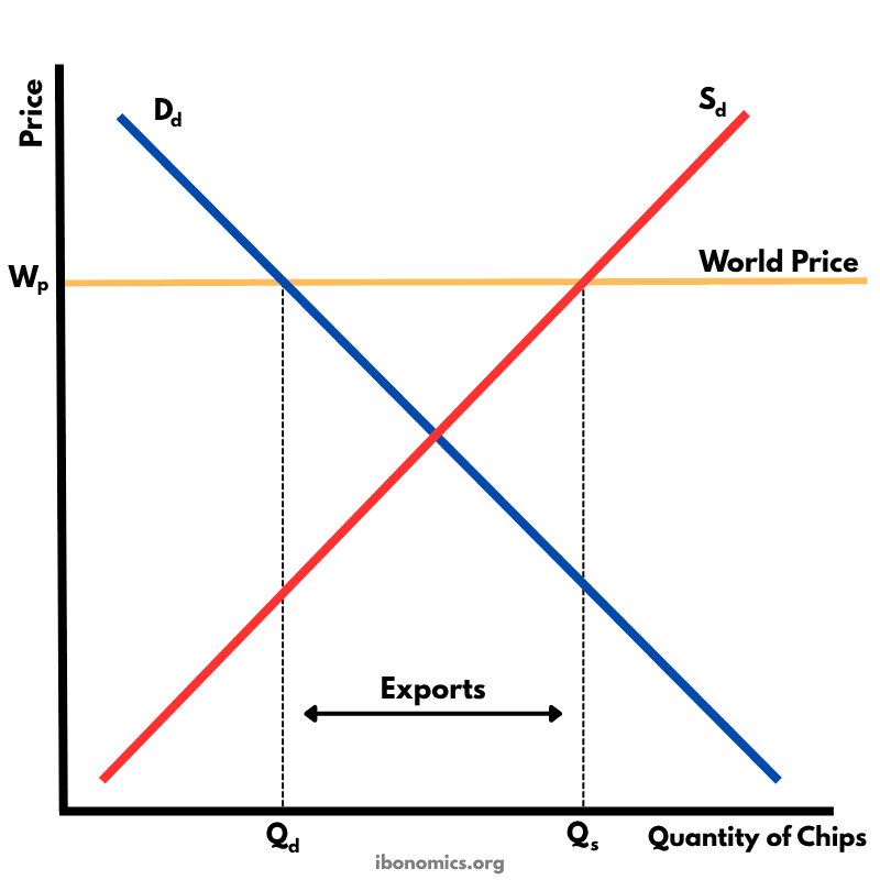
This diagram shows how a country exports goods under free trade when the world price is higher than the domestic equilibrium price.
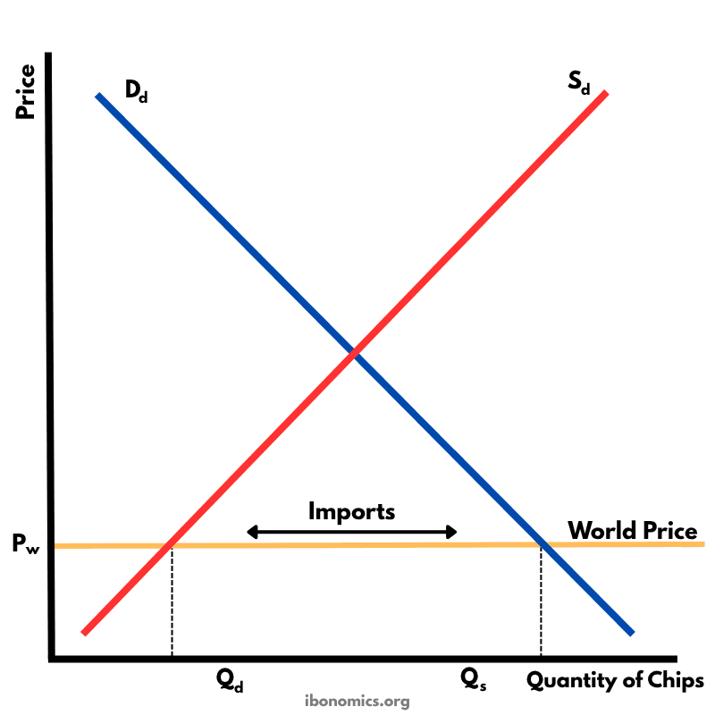
This diagram illustrates how a country imports goods under free trade when the world price is lower than the domestic equilibrium price.
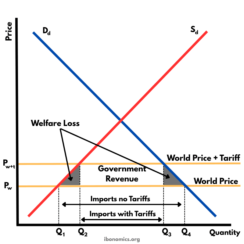
This diagram shows the effects of a tariff imposed on imported goods. A tariff raises the price of imports, protecting domestic producers but creating welfare losses.
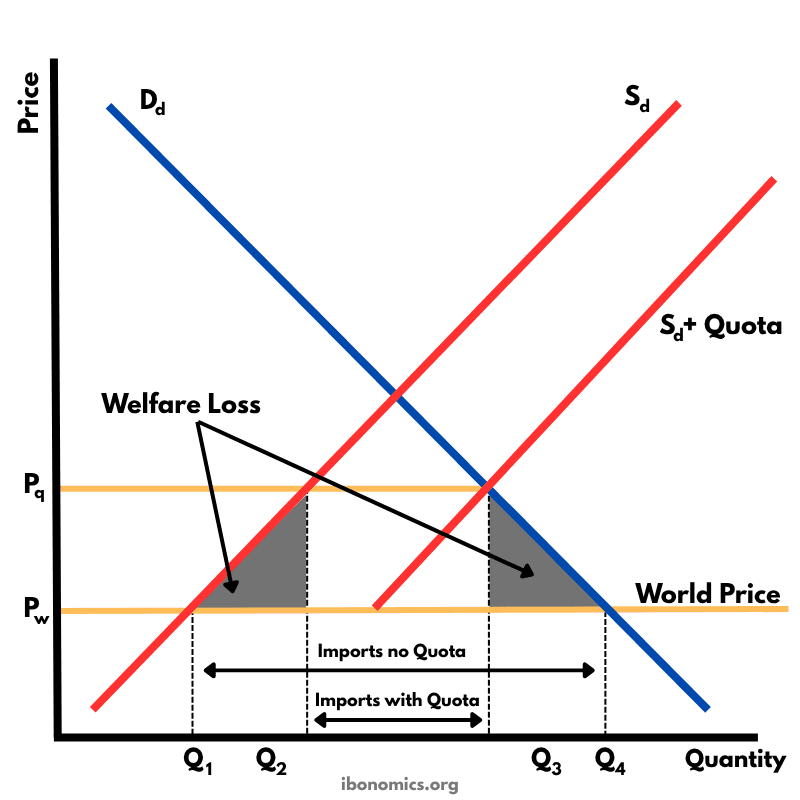
This diagram shows the impact of an import quota that limits how many units of a good can be imported. By restricting imports, the domestic price rises above the world price, domestic producers expand output, consumers buy less, and there is a net welfare loss.
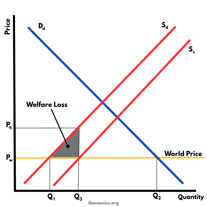
This diagram illustrates the effects of a production subsidy, where the government supports domestic producers to lower their costs and increase output. It is a form of protectionism without raising consumer prices directly.
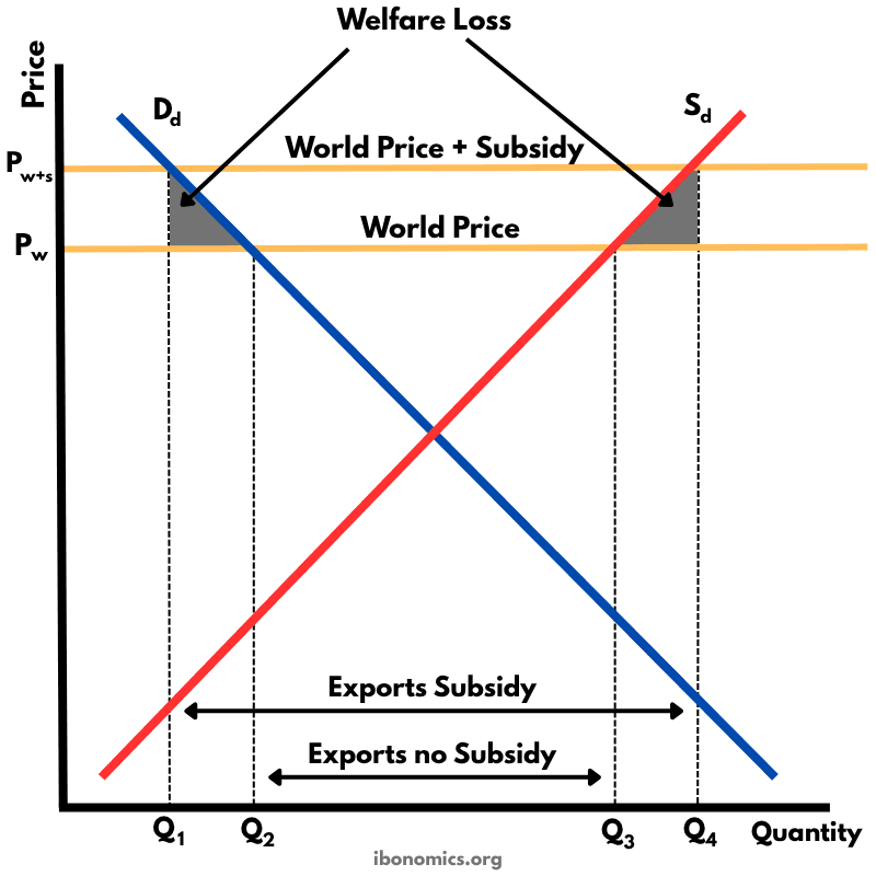
This diagram shows how an export subsidy raises the domestic price above the world price, encouraging producers to export more while reducing consumer welfare and creating deadweight losses.