Fixed Exchange Rate – Central Bank Intervention
Global Economics
This diagram shows how a central bank intervenes in the foreign-exchange market to maintain a fixed (pegged) exchange rate after an external shock shifts demand.
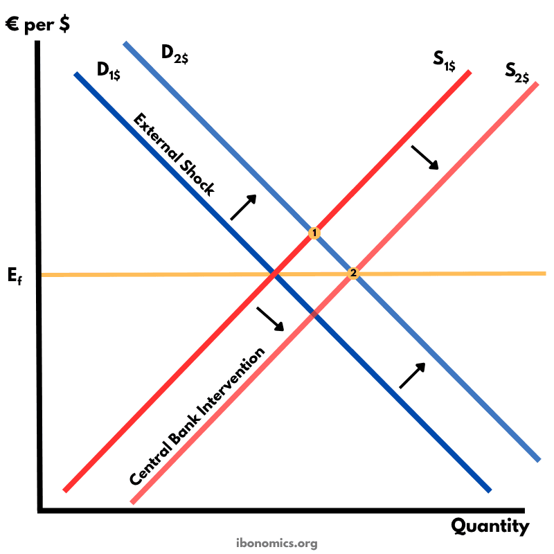
Curves and Elements
d1
D1$: Original demand for dollars.
d2
D2$: Higher demand after an external shock.
s1
S1$: Initial supply of dollars in the forex market.
s2
S2$: Supply of dollars after central-bank intervention.
ef
Ef: Fixed (pegged) exchange-rate level.
point1
Point 1: Pre-shock equilibrium on the peg.
point2
Point 2: Post-intervention equilibrium back on the peg.
The currency is initially pegged at the fixed rate Ef, where demand for the dollar (D1$) intersects supply of the dollar (S1$).
An external shock (e.g., higher foreign demand for exports or higher domestic interest rates) shifts the demand curve rightward from D1$ to D2$, creating upward pressure on the exchange rate.
To prevent the domestic currency (euro) from depreciating against the dollar (i.e., the dollar appreciating), the central bank sells dollars (increasing the supply of dollars) or buys euros, shifting the supply curve rightward from S1$ to S2$.
The new intersection (point 2) restores the exchange rate at Ef but increases the quantity of dollars traded in the market.
Maintaining a fixed rate requires adequate foreign-exchange reserves; prolonged intervention can be costly and may conflict with domestic monetary policy goals.
More Global Economics Diagrams
Explore other diagrams from the same unit to deepen your understanding
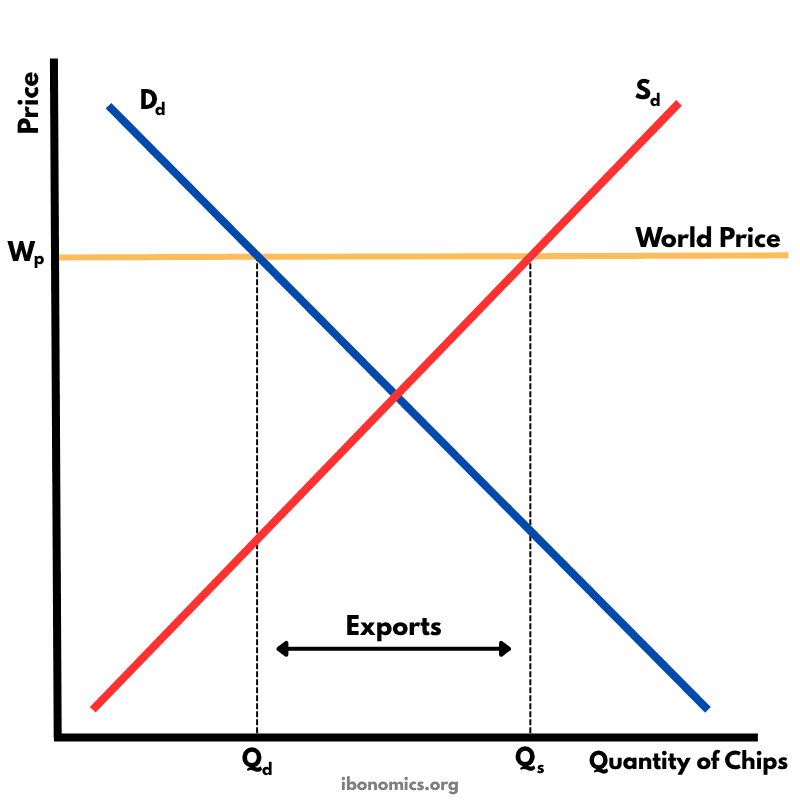
This diagram shows how a country exports goods under free trade when the world price is higher than the domestic equilibrium price.
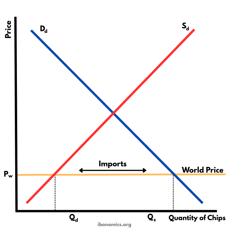
This diagram illustrates how a country imports goods under free trade when the world price is lower than the domestic equilibrium price.
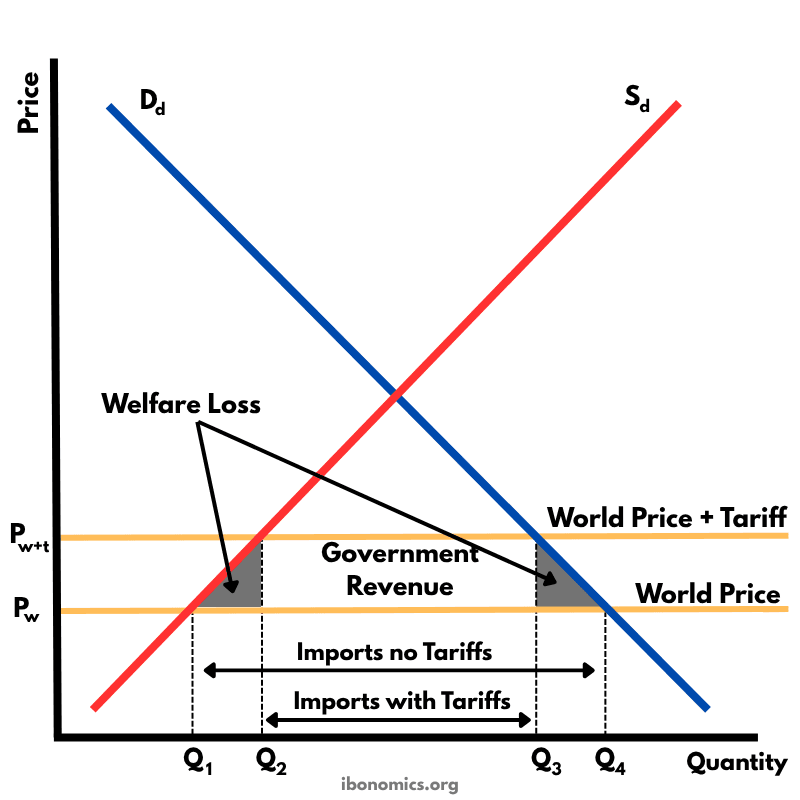
This diagram shows the effects of a tariff imposed on imported goods. A tariff raises the price of imports, protecting domestic producers but creating welfare losses.
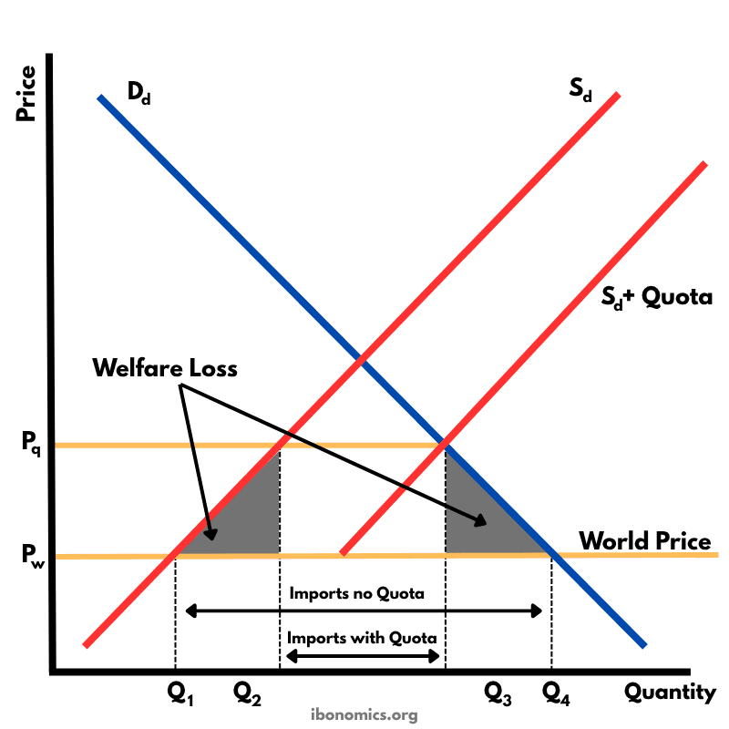
This diagram shows the impact of an import quota that limits how many units of a good can be imported. By restricting imports, the domestic price rises above the world price, domestic producers expand output, consumers buy less, and there is a net welfare loss.
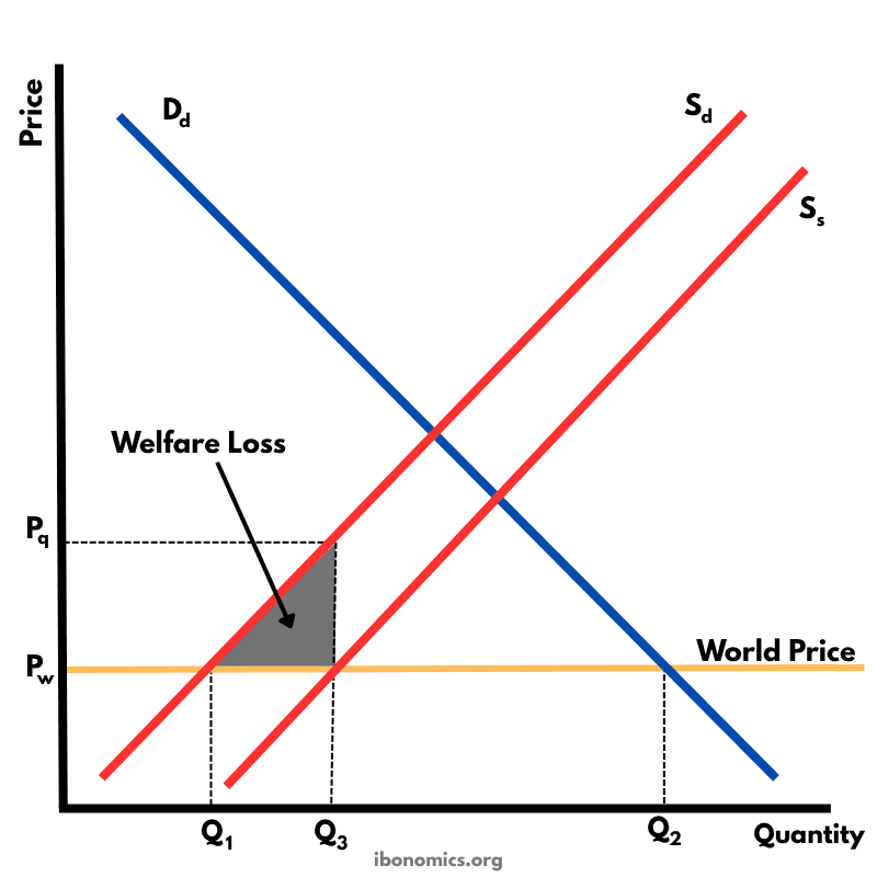
This diagram illustrates the effects of a production subsidy, where the government supports domestic producers to lower their costs and increase output. It is a form of protectionism without raising consumer prices directly.
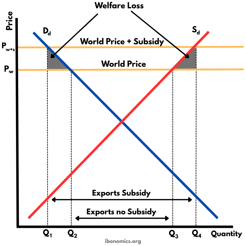
This diagram shows how an export subsidy raises the domestic price above the world price, encouraging producers to export more while reducing consumer welfare and creating deadweight losses.